Typography system
Spectrum's typography system defines the styles, measurements, and behaviors used to create consistent typography across products and platforms. This page covers font weights, font sizes, type styles, and platform considerations.

Hierarchy
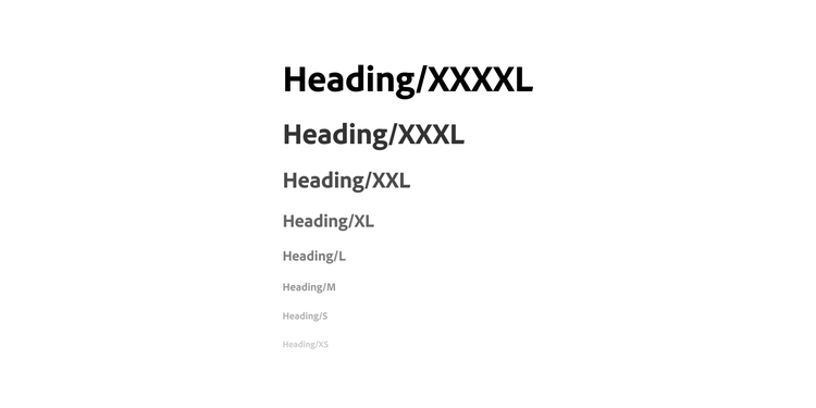
Typography in Spectrum is aligned to an information hierarchy model, and it also echoes the foundational concept of attention hierarchy. Hierarchy in these type styles can be conveyed through font size, font weight, and font color. Larger-sized, heavier-weight, and darker-colored text draws more attention, and it communicates the most broad ideas (the need-to-know information). Smaller-sized, lighter-weight, and lighter-colored text draws less attention, and it communicates the most specific ideas (the nice-to-know information).
Font weight
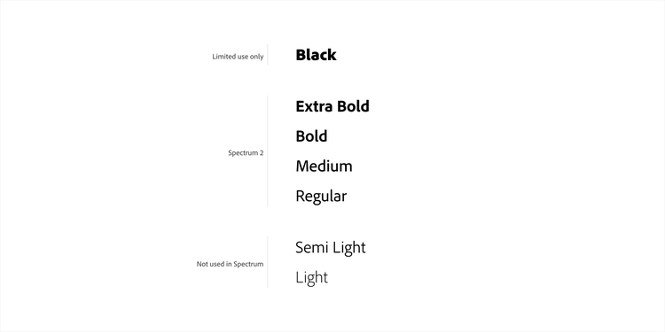
Spectrum offers guidance for a wide range of font weights to help establish visual hierarchy in layouts.
ExtraBold
Spectrum recommends ExtraBold as the heaviest font weight for most use cases. This provides more contrast against the Title type style (which uses Bold), and it's also more in line with contemporary design considerations.
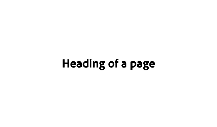
In limited cases, products may use the Black font weight to support product-specific branding. For example, Adobe Express uses Black for headings to align with Adobe Express brand guidelines. Black should be reserved for heading type styles and used at 18 px or larger to maintain legibility.

Bold
Select elements in the UI use a Bold font weight. Bold text is often used to accentuate the primary focus on a page or in a container, and in many uses, it's paired with regular body text to create hierarchy. It's also used to directly refer to the names of UI elements in running text. Titles, file names, user names, and button labels all use bold weight.
Medium
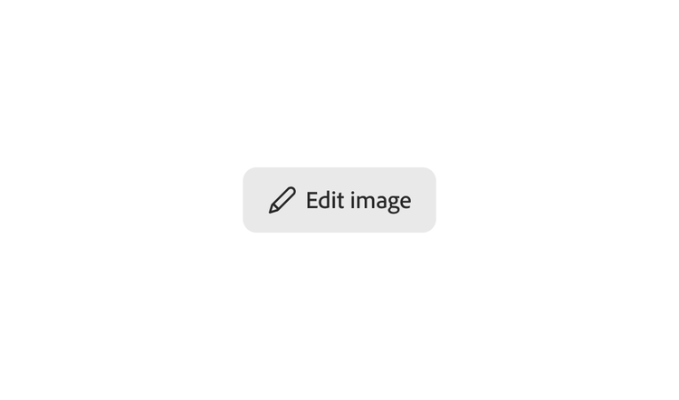
Medium is used for specific components that need visual balance with Spectrum's icons, which use a 1.5 px stroke. Action buttons, badges, and tags are examples of components that use Medium weight labels.
Regular
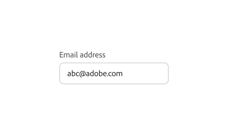
Regular is the default font weight for Spectrum components and body text. It should also be used for any content that's entered by users, is editable, or longer in form (for example, text fields and text areas).
Text formatting
Text formatting can be used to visually add clarity and adjust voice or meaning.
Bold
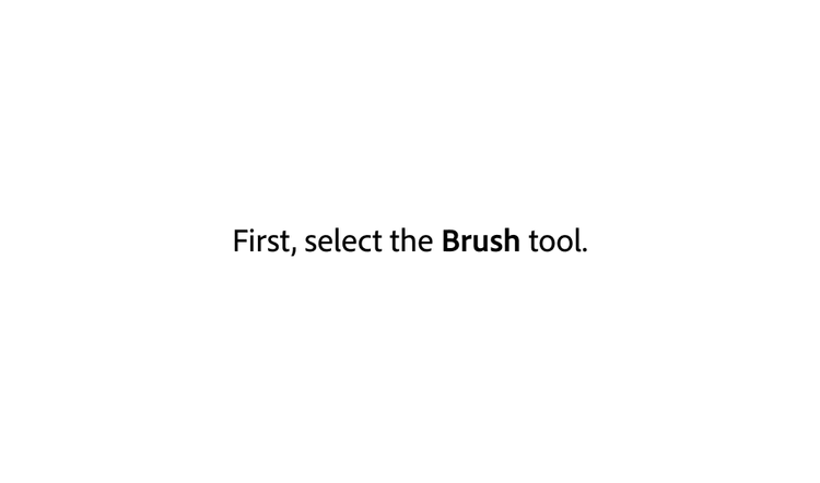
Select elements in the UI use a Bold font weight. Bold text is often used to accentuate the primary focus on a page or in a container, and in many uses, it's paired with regular body text to create hierarchy. It's also used to directly refer to the names of UI elements in running text. Titles, file names, user names, and button labels all use bold weight.

Underline
Underline is used only for text links (either hover state or default state, depending on the style of the link) and should never be used as a mechanism for adding emphasis.
Strong
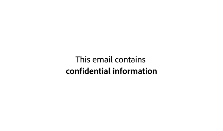
Strong can be used for placing importance on part of a sentence, rendering the text as a heavier font weight. This is for semantic formatting, when it's intended to add a tone that conveys importance.
Emphasis
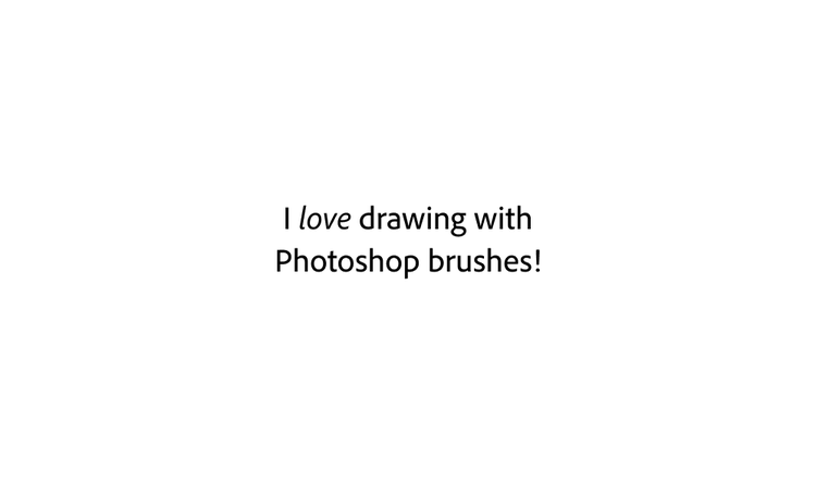
Emphasis can be used for placing emphasis on part of a sentence, rendering the text as italic (or heavier weight, in CJK languages).
Font size
Spectrum ensures that different sizes of text can work together harmoniously, on both desktop and mobile. All font sizes follow the Major Second type scale, which has a ratio of 1.125. This means that each size is multiplied or divided by 1.125 from the previous size, starting with the base size (font-size-100), and rounded to the nearest whole number. Custom text (any non-existing typography styles) or modifications to existing type styles should use a font size from this list.
When selecting font sizes to ensure readability, keep in mind that Adobe Clean does not match 1:1 with system font size definitions. It's generally a size smaller than system fonts such as SF Pro, Segoe UI, Roboto, and others.
font-size-25font-size-50font-size-75font-size-100font-size-200font-size-300font-size-400font-size-500font-size-600font-size-700font-size-800font-size-900font-size-1000font-size-1100font-size-1200font-size-1300font-size-1400font-size-1500Line height
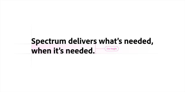
Line height controls the vertical space between lines of text and plays an important role in readability and visual hierarchy. When line height is too tight, text becomes more difficult to scan. When it is too loose, related content can feel disconnected.
Line height is implemented differently across platforms because each platform calculates and renders it differently. As a result, equivalent typography styles may use different line height values.
Spectrum Web
Spectrum Web defines default line height values for each font size in the type scale. Heading, Title, Detail, and Component type styles use these values to maintain balanced spacing across a range of text sizes.
The default line height gradually decreases from approximately 130% at smaller font sizes to 115% at larger sizes, then rounds to whole even pixel values. This helps maintain consistent visual spacing while avoiding half-pixel rendering within components.
Body and Code type styles use a more spacious line height of 1.5× the font size to improve readability for longer passages of text. For Chinese, Japanese, and Korean (CJK) languages, Spectrum uses a 1.7× multiplier to accommodate the visual characteristics of those writing systems.
Learn more about the line height calculations, interpolation, and rounding methodology in the Adobe Clean Spectrum Wiki.
Spectrum Web
Spectrum Web defines default line height values for each font size in the type scale. Heading, Title, Detail, and Component type styles use these values to maintain balanced spacing across a range of text sizes.
The default line height gradually decreases from approximately 130% at smaller font sizes to 115% at larger sizes, then rounds to whole even pixel values. This helps maintain consistent visual spacing while avoiding half-pixel rendering within components.
Body and Code type styles use a more spacious line height of 1.5× the font size to improve readability for longer passages of text. For Chinese, Japanese, and Korean (CJK) languages, Spectrum uses a 1.7× multiplier to accommodate the visual characteristics of those writing systems.
line-height-font-size-#line-height-200Spectrum iOS
Because iOS calculates line height differently from other platforms, Spectrum iOS recommends using auto or normal for the default line height. This allows the system to apply Apple's built-in text metrics and produce the intended typography.
Spectrum Android
Spectrum Android defines line height using scale-independent pixels (sp), allowing text and vertical spacing to scale together with a user's font size and accessibility preferences. In Figma, equivalent pixel (px) values are used to match the intended visual appearance while maintaining a consistent design-to-engineering workflow across platforms.
Type styles
Also known as text styles in Figma, Spectrum uses type styles to help maintain a consistent semantic meaning and create accessible, legible, and on-brand experiences across platforms.
The type styles include Heading, Title, Body, Detail, Component, Code, and Monospace numbers. These styles come in a range of t-shirt sizes (such as Small, Medium, and Large) and encompass typography elements like font family, font size, line height, weight, and color. This ensures that all Adobe interfaces can maintain a predictable sense of information hierarchy.
Keep in mind that a single product won't need all of these sizes, and especially at the same time. Spectrum's type styles are intentionally comprehensive to allow platform and product teams to selectively choose type styles that accommodate their unique needs.
As a starting point, use a t-shirt size from each of the type styles. For example: pair Heading Medium with Title Medium, Body Medium, and Medium t-shirt sized components.
If you'd like to override these styles, there's some flexibility for you to define your own typography and hierarchy as long as any customization follows Spectrum guidance for font size and color usage. Use what best fits your context and best supports your users.
Explore platform-specific type styles in each platform's Figma library:
Type styles
Also known as text styles in Figma, Spectrum uses type styles to help maintain a consistent semantic meaning and create accessible, legible, and on-brand experiences across platforms.
The type styles include Heading, Title, Body, Detail, Component, Code, and Monospace numbers. These styles come in a range of t-shirt sizes (such as Small, Medium, and Large) and encompass typography elements like font family, font size, line height, weight, and color. This ensures that all Adobe interfaces can maintain a predictable sense of information hierarchy.
Keep in mind that a single product won't need all of these sizes, and especially at the same time. Spectrum's type styles are intentionally comprehensive to allow platform and product teams to selectively choose type styles that accommodate their unique needs.
As a starting point, use a t-shirt size from each of the type styles. For example: pair Heading Medium with Title Medium, Body Medium, and Medium t-shirt sized components.
If you'd like to override these styles, there's some flexibility for you to define your own typography and hierarchy as long as any customization follows Spectrum guidance for font size and color usage. Use what best fits your context and best supports your users.
Heading
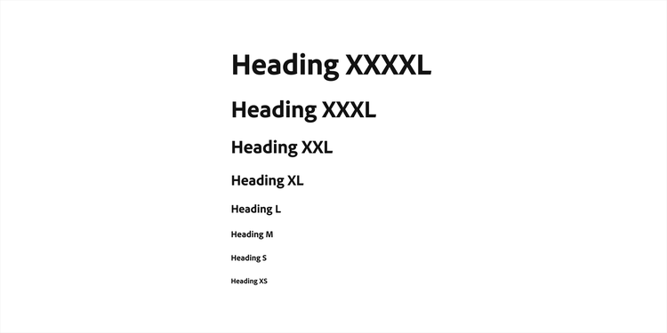
Heading text represents the biggest and boldest text on a page, and it draws the most attention. Only the broadest idea, such as the main page title, should use this style.
Spectrum Web
Spectrum iOS

Spectrum Android

Title
While the Heading style is for the loudest, most broad message, there are still going to be other important items in an information hierarchy. The Title style is for text that's communicating other need-to-know concepts. It's often set in Bold weight, and it has a range of font sizes that can be paired with Body and Detail sizes to create visual balance. File names, cards, user names, panels, and other high-signal concepts in interfaces use the Title style.
Spectrum Web

Spectrum iOS

Spectrum Android

Body
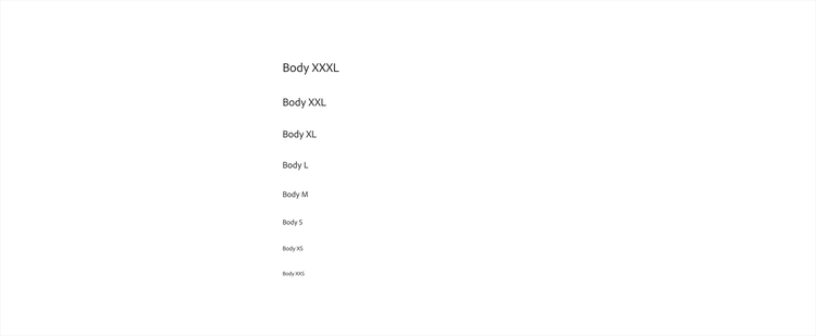
Body is the type style that's primarily used for longer-form text that may extend to multiple lines. "Body text" is a frequently used term to describe the text that creates the main content on a page, which is where this style gets its name from.
Spectrum Web
Spectrum iOS

Spectrum Android

Detail
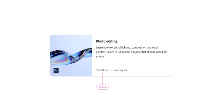
"Detail text" is a broad term for any kind of text that communicates ideas that are even more specific than body text. Text using the Detail style acts as supporting context to any other information presented.
Detail text often uses Medium weight when paired with iconography, to maintain visual balance with the 1.5 px stroke width of Spectrum 2 icons. It also often uses detail-color (gray-600) to appear more subdued in terms of visual hierarchy.
Component
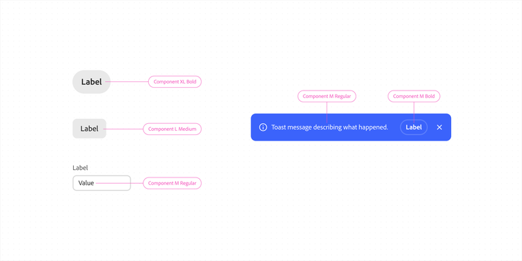
Component is the type style that is applied to text within UI components. The Component type style comes in multiple font weights to support its flexibility across components in the design system. For example, the Spectrum button uses the Component type style with bold weight. Action button uses the Component type style with medium weight, and text field uses the Component type style with regular weight.
Component styles are supported on Web only. Spectrum offers component text styles in the Spectrum Web Figma library, to let you quickly apply text formatting to any text element in a design. This will help you stay connected to the system without needing to detach or override other text styles like Body or Title.
For iOS and Android, use type styles that share corresponding weight and sizes from Title, Body, and Monospace number styles.
Code
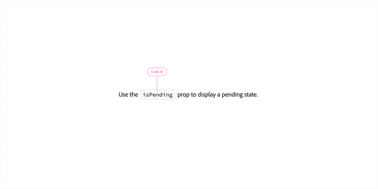
Code is a typography component used for text that represents code. The default font for showing code is Source Code Pro.
Code styles are currently supported on Web only.
Monospace numbers
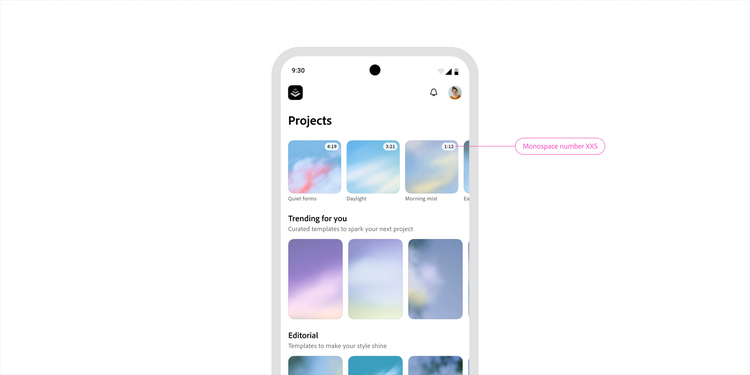
Monospace numbers are used for numeric content that benefits from consistent alignment, such as timestamps, counters, and adjustable values. Because each digit occupies the same horizontal space, they reduce visual shifting and make changing values easier to compare and scan.
Monospace numbers are currently supported as type styles on iOS and Android only. Learn more about using tabular numbers.
Comparing body, component, and detail
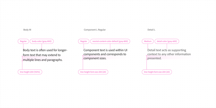
The differences between Body text, Component text, and Detail text are nuanced and often come down to applied semantic meaning. The characteristic differences in Detail text are the default weight, size, letter spacing, all-caps treatment for marketing contexts, and color usage. Detail text defaults to Medium weight, a smaller font size, and lighter shades of gray. It also uses the updated per-font-size line height, while Body text uses the spacious line height multiplier of 1.5x font-size.
Note: There are known similarities between the Component and Detail styles, specifically when using these for text such as metadata and labels. There are nuanced semantic differences, but when in doubt, use the Component type style because it is more adaptable.
Fallback fonts
Spectrum defines fallback fonts for situations where Adobe Clean Spectrum isn't available. These fonts are selected to provide a consistent experience across operating systems while maintaining similar typographic characteristics.
Non-Latin scripts
Spectrum supports a wide range of non-Latin writing systems. On the web, Spectrum uses dedicated fonts for these scripts, such as Adobe Clean Han for Chinese (Simplified and Traditional), Japanese, and Korean (CJK). On iOS and Android, Spectrum uses the platform's system fonts for non-Latin scripts to reduce app size. Android system fonts may vary by device.
Because different typefaces are used across platforms, text metrics may vary. When designing custom layouts, verify that text alignment and spacing remain consistent across localized experiences.
Platform considerations
Spectrum iOS
Dynamic type
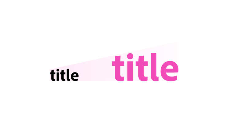
Spectrum typography on iOS supports Dynamic Type, Apple's system for scaling text based on a user's preferred reading size. When a user adjusts their text size in accessibility settings, Spectrum typography scales automatically to match.
Learn more in Apple's Developer Documentation: Get started with Dynamic Type and WWDC24: Scaling fonts automatically.
Spectrum Android
Font scaling
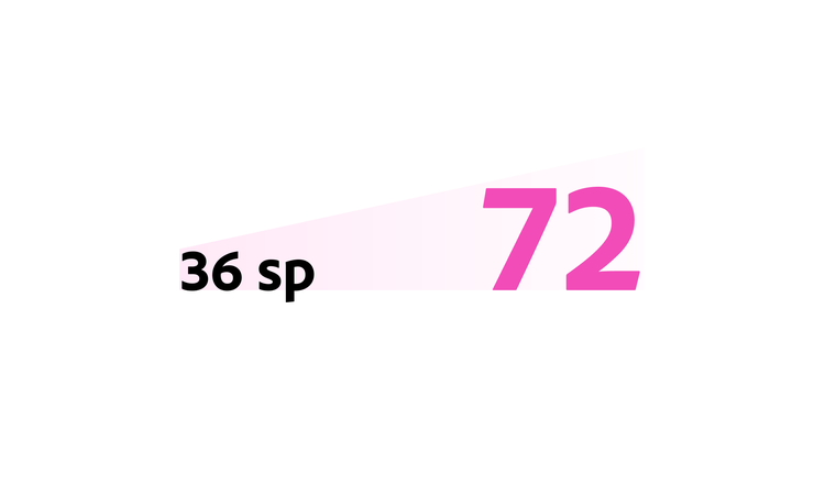
Spectrum typography on Android uses scale-independent pixels (sp), which automatically respond to a user's font size preferences. This allows text to scale with Android accessibility settings without additional configuration.
Learn more in Android Accessibility: Text scaling and Android 14: Font scaling.
Download the Spectrum Android Catalog app to explore available type sizes and see how they respond to accessibility settings. Refer to the installation guide for setup instructions.
Font scaling
Spectrum typography on Android uses scale-independent pixels (sp), which automatically respond to a user's font size preferences. This allows text to scale with Android accessibility settings without additional configuration.
Learn more in Android Accessibility: Text scaling and Android 14: Font scaling.