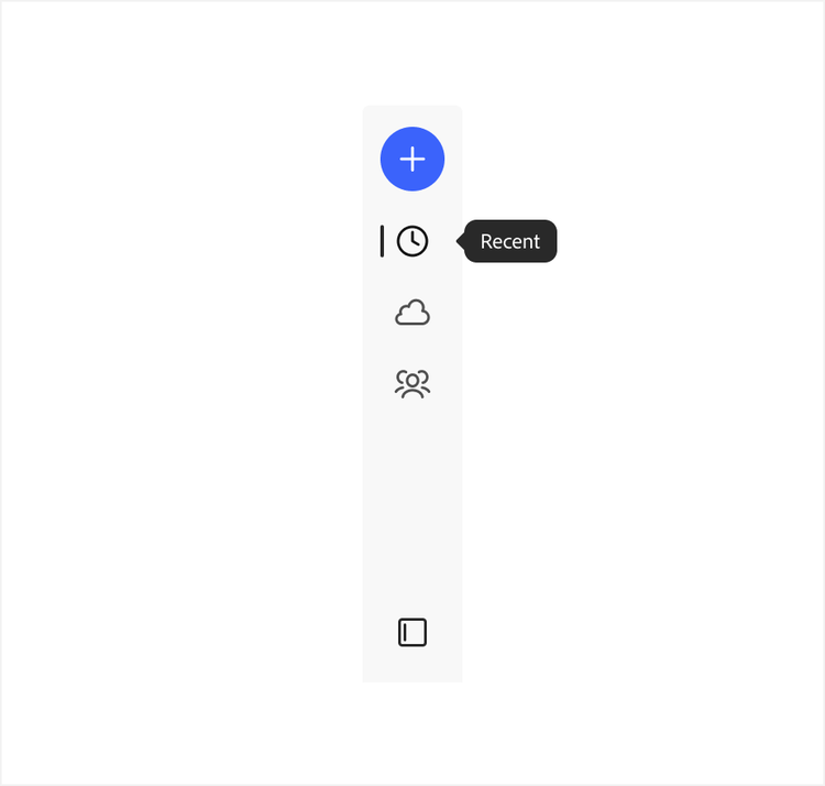
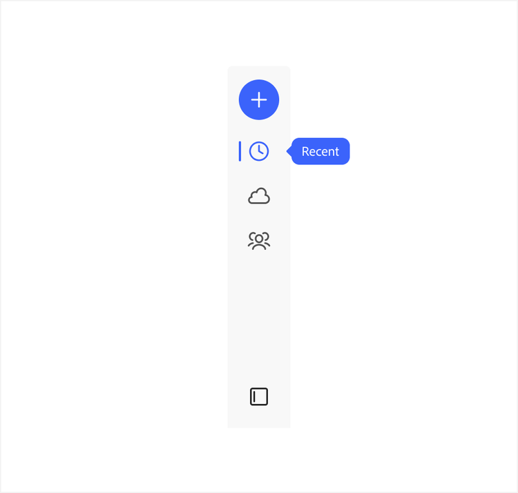
Attention hierarchy
Design systems are ultimately communication systems. A main goal of any kind of UI communication — visual, linguistic, motion, and more — is to convey a message in a way that the audience can readily understand what they need to know and why it matters. And most importantly, communication needs to be respectful of user attention.
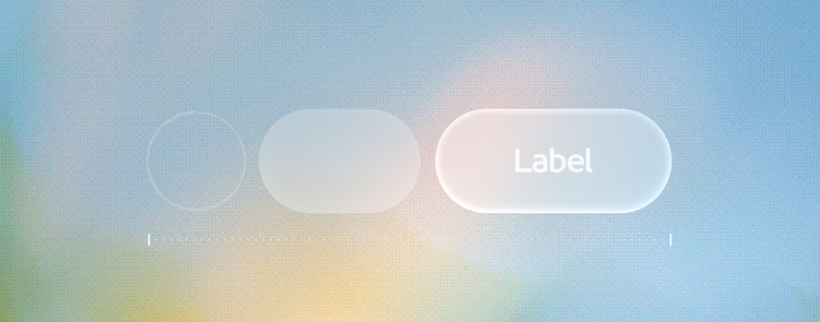
Attention hierarchy
Attention hierarchy is a core concept in Spectrum 2. This idea has always been a part of Spectrum as a design system — and a tenet of responsible UX design as a whole — but it’s now more formalized as a way to validate assumptions using clear guidelines and considerations. It’s based on the methods of typographic hierarchy, where scale, size, and text pairings help readers to readily recognize what’s the most broad and important information to the most detailed and nice-to-know information. We’ve extended this practice beyond just text and into all the ways that UI communicates.
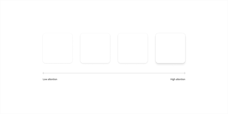
Another way to think of attention hierarchy is as a way to manage the ratio of signal-to-noise in an experience. Different parts of the UI all communicate meaning, at different levels of attention. High attention elements show a primary area of focus, and communicate timely, high-signal meanings. Low attention elements blend into the background, and communicate more utilitarian, lower-priority meanings. Things like object styles, component options, and typography all draw different levels of attention.
Working with attention hierarchy
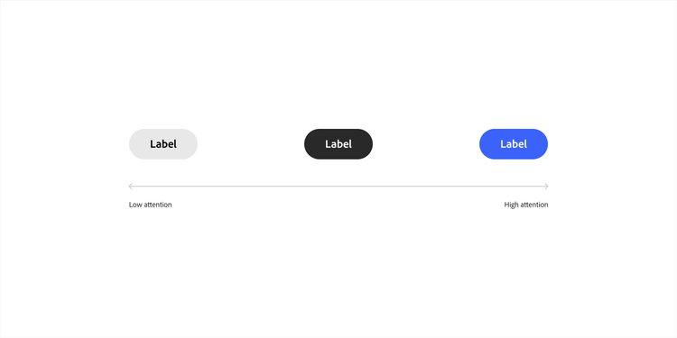
High attention elements should be used sparingly and selectively. If too many things are high attention at once, the experience becomes noisy and unfocused. For example, both high-contrast colors and elevation communicate specific meanings and add emphasis within pages and flows — and these are both used very thoughtfully.
Example
As a general rule, only one element or group of elements should have high attention on a page. Too many elements drawing high attention makes it difficult to focus.