Applying the type system
The following examples demonstrate how Spectrum's typography system works in practice. Learn how to combine type styles to create clear visual hierarchy, improve readability, and organize information across different interface layouts.

Typography examples
The following are some general examples to show how the Spectrum 2 typography system all comes together, and how type styles can be used together to create visual hierarchy.
Card
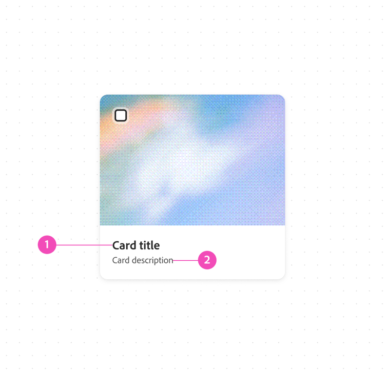
In this card example, Title and Body text styles are used together to establish a clear visual hierarchy, helping users quickly identify the primary content while keeping supporting information easy to scan.
- Title S
The card title uses the Title style to establish the primary focus of the card. It provides strong visual emphasis, making it easy for users to quickly identify and scan content across multiple cards. - Body XS
The supporting description uses the Body style because it provides additional context without competing with the title. Its lighter weight and smaller size reinforce the content hierarchy while maintaining readability. The body text is presented in gray-700 to further distinguish it as secondary information and keep attention on the primary title.
Page section
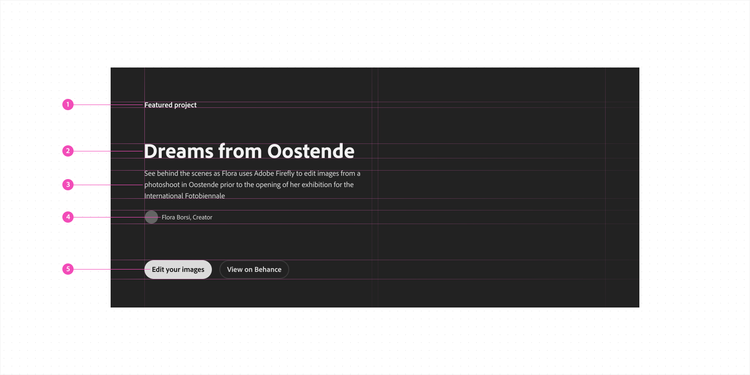
Spectrum's type scale creates a clear visual hierarchy that naturally guides the eye through the page. By assigning each type style a distinct role, Spectrum organizes information into predictable patterns that make content easier to scan and understand.
- Title M
- Heading XXL
- Body M
- Body S
- Component M, used in a button group
Mobile browsing
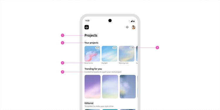
The same typography principles scale across screen sizes. On native mobile platforms, Spectrum preserves a clear visual hierarchy by adapting type styles to smaller layouts while maintaining consistent relationships between headings, supporting content, and actions.
- Heading L
- Title L
- Body XS
- Body S
- Monospace number / Body XXS
Usage guidelines
All-caps
All-caps styles are not recommended for usage within UI components because it does not support accessibility requirements
An all-caps style can still be used sparingly and strategically in use cases where longform content is the primary experience (like a blog post or a marketing website). All-caps text brings a heavier, punctuated feel to letterforms and adds visual impact to single words or short, standalone phrases.

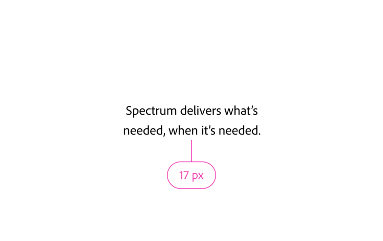
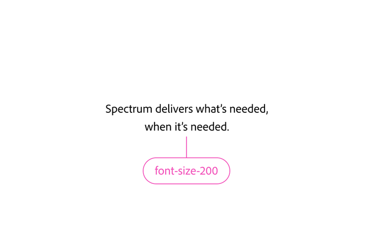
Use Spectrum font sizes
Choose from Spectrum's defined font sizes. By using unique font sizes, you risk upsetting the hierarchy and balance of typography in your product.
Respect capitalization rules
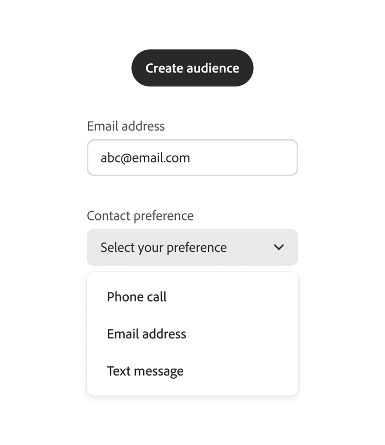
Use sentence case for all UX content. For more on capitalization guidelines, go to Grammar and mechanics.
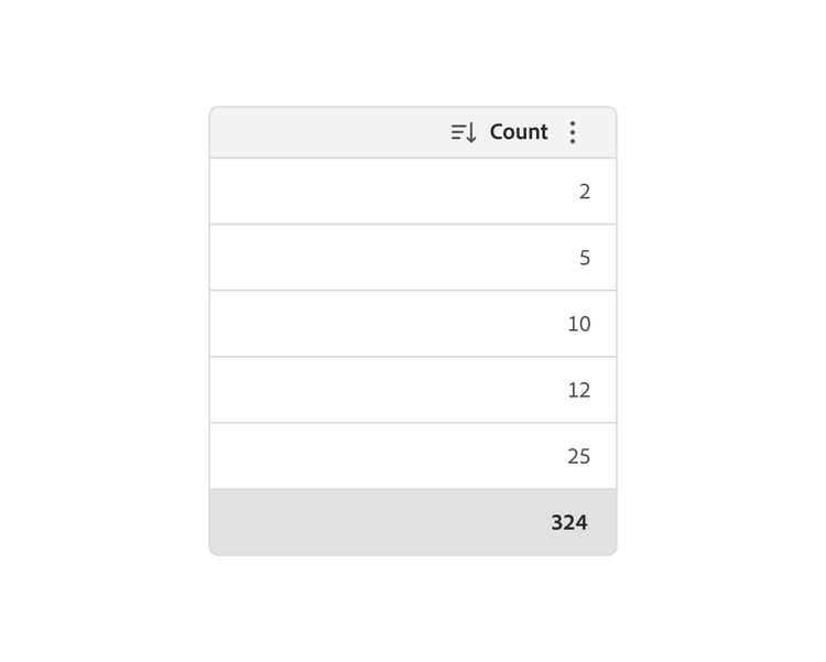
Use tabular numbers for numerical data
Numbers within components should be tabular with lining figures. In tables, numbers should be right aligned to make numerical data easier to read and compare. This is used, for example, in tables, time stamps, and bar loaders. This is supported by Adobe Clean (via the Monospace uppercase option in Figma, the OpenType panel in Illustrator, or the CSS font feature settings). For iOS and Android, use the Spectrum Monospace numbers type styles.
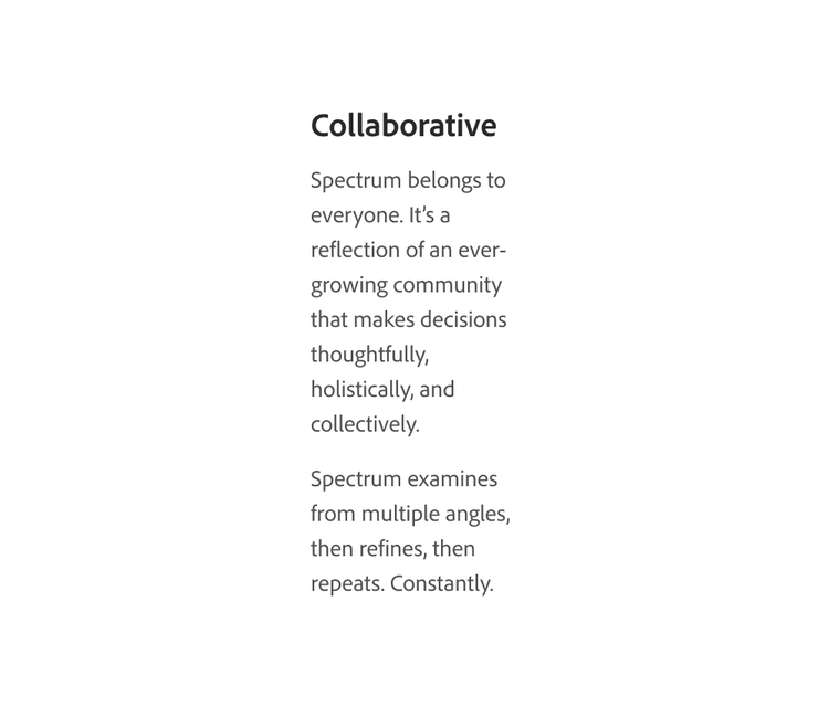
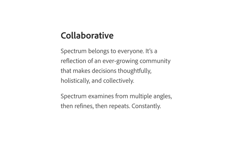
Don't let paragraph widths get too thin
Paragraphs of text that are too long are difficult to follow, and paragraphs of text that are too thin are difficult to read. Ideally, blocks of text should be roughly 70 characters wide. Be sure to keep them at least between 50 and 120 characters wide.
Keep content short and to the point
Keep paragraphs concise. Some users with cognitive disabilities (and even those who don't) can have a very difficult time reading and comprehending large blocks of text.
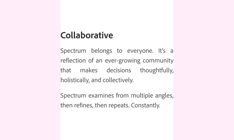
Don't fully-justify text
Do not use fully-justified blocks of text. This adds trapped white space within paragraphs, which makes it harder to read, especially for those with cognitive disabilities or dyslexia. Right alignment (left rag) is also discouraged for paragraphs of text.