Grammar and mechanics
Our UX writing style follows our in-product voice principles.
These guidelines apply to text in U.S. English, our source language for writing in-product content. Defer to component-level style guidance when needed, and keep in mind that in-product language is internationalized according to specific locale standards and style.

AP style
We use Associated Press (AP) style for in-product UX writing, with any exceptions noted on this page.
Active and passive voice
Use active voice in most cases and use passive voice sparingly.
- With active voice, sentences are simpler, shorter, clearer, and more conversational.
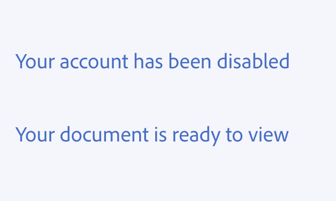
- With passive voice, you can soften and provide distance in select situations (e.g., notification of a disabled account).
Active voice
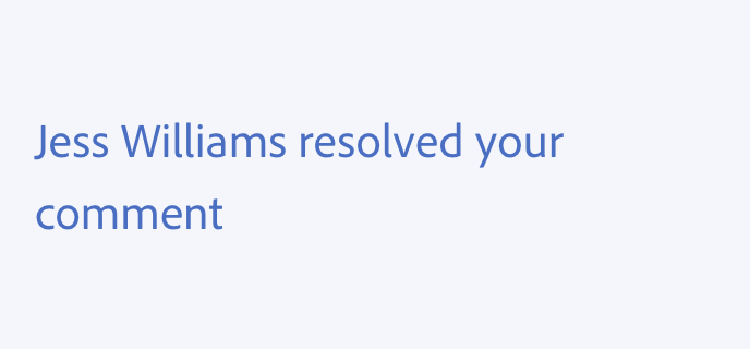
In an active sentence, it's clear who's doing what. The actor is the subject, and the subject of the sentence is doing something.
Passive voice
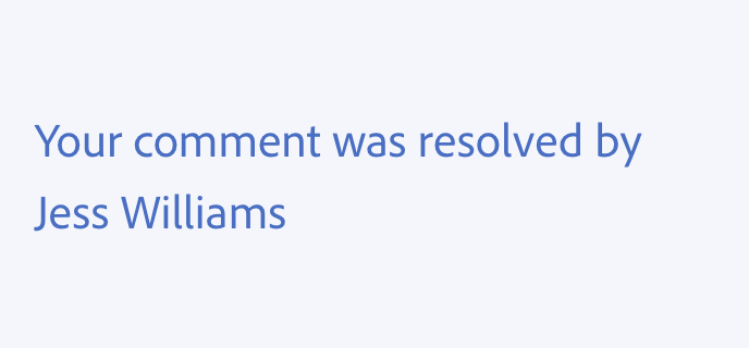
At times, active voice can come across too harshly. In these cases, use passive voice. This separates the actor from the action enough to soften a sentence.
In a passive sentence, action is being taken upon the subject.
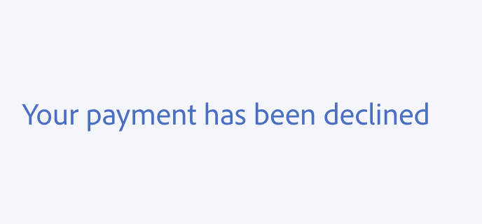
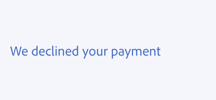
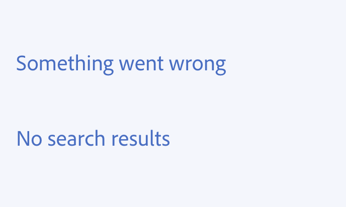
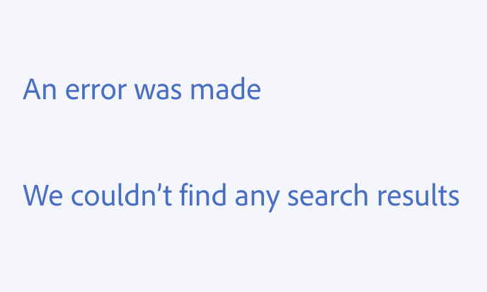
Avoid passive voice by reframing the focus
You can usually reframe a message to focus on the object, or on the actions someone could take, as another way to avoid passive voice.
Contractions
Use contractions to sound more conversational and natural.
Common contractions
Use commonly understood contractions to keep sentences from feeling out-of-touch, robotic, or overly formal.
Some common contractions:
- What's
- We'll
- You'll
- You're
- You've
- We're
- They're
- Doesn't
- Didn't
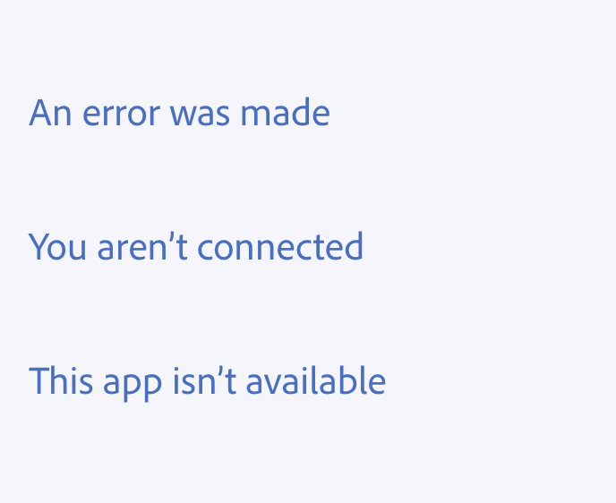
- Isn't
- Aren't
- Can't
Contraction considerations
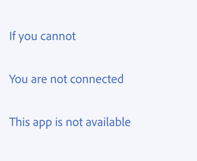
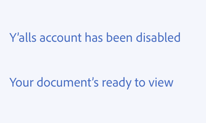
- Avoid contracting nouns with is, does, has, or was. This might make it look like the noun is possessive.
- Don’t use uncommon or old-fashioned contractions (e.g., would’ve or tweren't).
- Don’t use colloquial contractions (e.g., ain't, y'all, yinz).
- Be mindful of how many contractions you use in a sentence. Too many contractions can make things difficult to read.
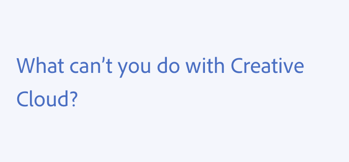
- Avoid using contractions when dealing with legal concerns, payment processing, and account security. Casual isn’t always the best style when handling sensitive information.
Verb tenses
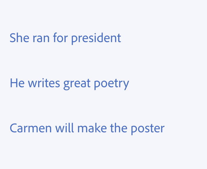
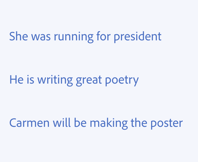
In general, use simple verb tenses: past, present, and future. Simple tenses are used to describe actions without specifically stating whether the actions are completed (perfect tenses) or ongoing (progressive tenses).
Use simple future tense to describe the result of an action or instant process that’s happening now, or to describe something that will occur in the actual future (i.e., not at the time someone encounters the message).
You entered an incorrect password.
You’ve entered an incorrect password.
You can't undo this action.
You’re not undoing this action.
Your credit card will be charged at the end of your trial.
Your credit card will have been charged at the end of your trial.
Why we use simple verb tenses
There are a number of reasons why we use simple verb tenses for in-product writing:
- They use fewer words and are more concise.
- They can make content easier to scan and faster to read. Fewer words and simpler phrases mean better readability.
- According to the latest U.S. Census, more than 20% of people living in the U.S. speak a language other than English at home. For more people, simple verb tenses are easier to understand.
- Present tense improves readability scores.
What's not simple tense
If any of the following comes before the verb in a sentence, it’s not simple tense:
- Was/wasn’t, were, weren’t
- Has/hasn’t, have/haven’t
- Is/isn’t, are/aren’t
- Be
If the verb in a sentence ends in “-ing,” it’s not simple tense.
Capitalization
Sentence case
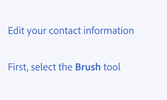
Use sentence case for all aspects of designing or re-designing Adobe product experiences, including titles and UI elements (e.g., tooltips, tabs, menu items). This transition will take time for older products, and temporary inconsistency is fine.
Writing in sentence case has been proven to be easier for users to read and comprehend, it sounds more friendly and less formal, and it helps better identify proper nouns and branded terms that need to be capitalized.
When to use sentence case:
- Only capitalize the first word in a phrase, title, or UI reference (e.g., Adjust borders tool)
- Always capitalize proper nouns and branded terms (e.g., Adobe Help Center)
- Capitalize acronyms (e.g., XD, AEM)
Title case
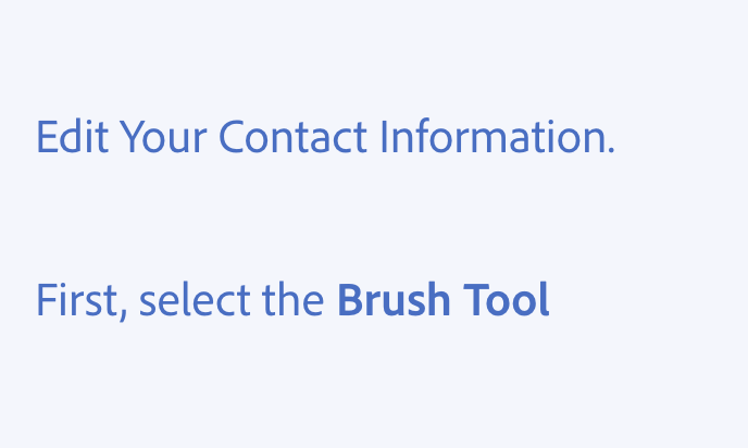
Use title case only when it clarifies that we’re speaking about a specific, official entity (such as a title or name). Title case is often a marker of formality in English, and overuse can cause users stress by implying formality or officialness where it doesn’t exist.
All caps
Use all caps sparingly.
When to use all caps:
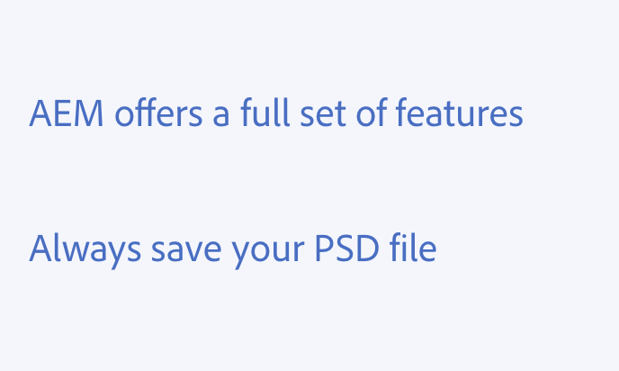
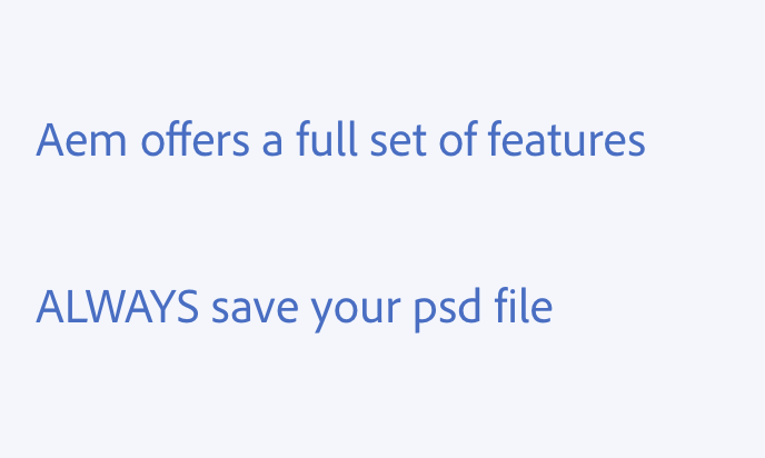
- Acronyms, such as accepted product names on second attribution (e.g., Adobe Experience Manager (AEM))
- Names of file extensions (e.g., TIF, ZIP, or PSD files)
All caps should never be used to emphasize a point.
Branded terms
Use title case to reference branded terms, such as names and features. This includes the names of Adobe products, like Adobe Photoshop or Advertising Cloud.
Here are some common branded terms:
- Creative Cloud
- Photoshop
- Lightroom
- Illustrator
- Premiere Pro
- XD
- Adobe Stock
- Document Cloud
- Fill & Sign
- Magic Heal
- Adobe Sensei
- Experience Cloud
- Advertising Cloud
- Analytics
- Audience Manager
- Campaign
- Experience Manager
- Commerce Cloud
- Marketo Engage
- Adobe Acrobat
- Adobe Sign
Pronouns
Referring to the user
In UX content, we want to talk about what’s happening rather than who or what is making something happen.
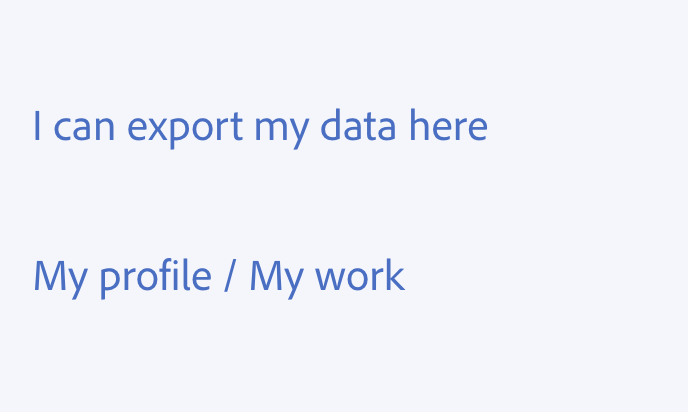
We avoid speaking as our users. In nearly all situations, we aim to be conversational and talk to the user — not as them. Any exceptions depend on situational needs for sensitivity and clarity.
Second person
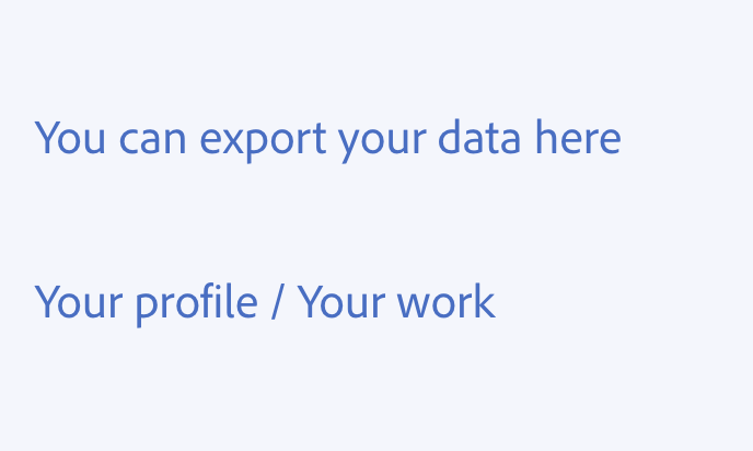
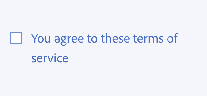
Most of the time, use second person (you, your, you’re) to address users and services.
First person
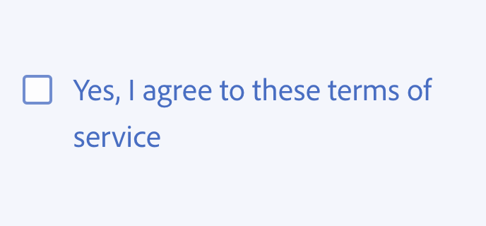
Use first person (me, I, my) only in these situations:
- Someone responds to the interface or answers a question they've been asked directly
- When additional sensitivity is necessary, or to indicate privacy
- When there's a legal need to use first person to ask for consent (e.g., “I agree to these terms and conditions”)
On rare occasions, it can be appropriate to use we or us to mean “Adobe”:
- "We're sorry" (for a critical error)
- "Help us improve this feature" (requesting feedback)
Singular they
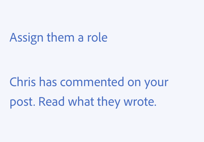
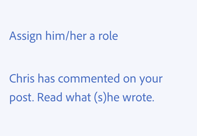
In most situations, Adobe doesn't need to know or assume the gender of our users. So when we refer to users, we use singular they.
We don’t use “he/she” or “(s)he” — those are clunky and they exclude users who identify outside of the male/female binary.
Use any of these variants of they in their proper grammatical contexts:
- They
- Them
- Their
- Theirs
- Themselves
- Themself
Punctuation
Punctuation marks are an essential part of language, and they extend beyond running text. They appear in code, mathematical equations, keyboard shortcuts, file names, and more. When there are established conventions for such contexts, punctuation marks should follow those conventions.
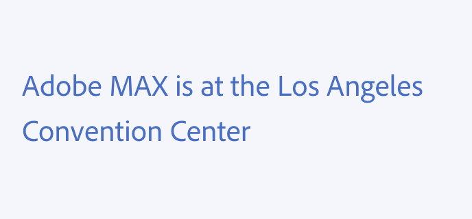
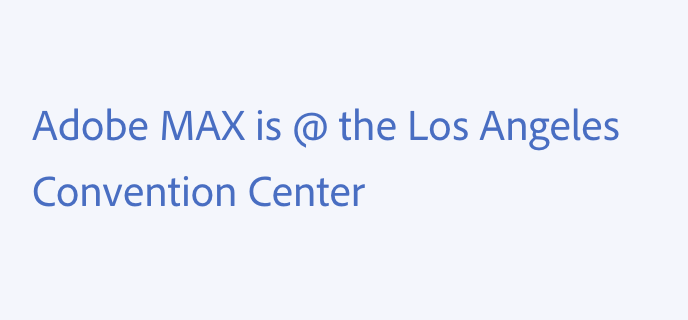
In general, don’t use punctuation marks in place of words (e.g., "&" instead of "and" or "@" instead of "at"). And, don’t use them as design elements, or for anything purely stylistic in purpose.
For punctuation within blocks of code, use the Code typography to differentiate the code from other written text.
Ampersand
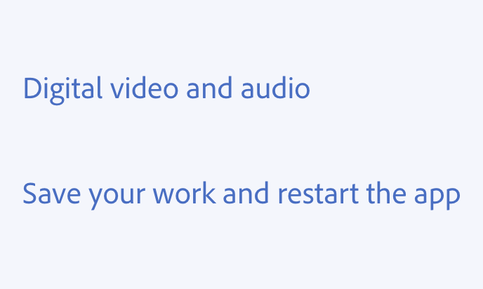
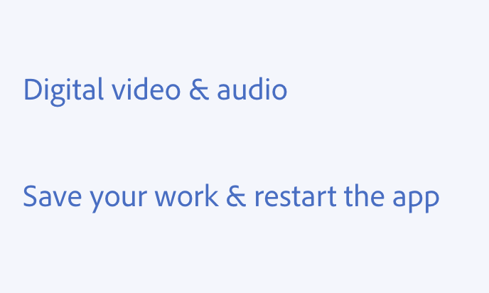
Don’t use ampersands (&) in UI copy. Instead, spell out the word “and.”
Using the word “and” is more inclusive, localizable, and readable:
- It’s more widely known and understood for people who are non-fluent English speakers
- It translates more easily into many languages
- Spelled-out words require less mental and cognitive effort to read
- Ampersands bring attention to the conjunction in a phrase which is the least important part of the sentence
- The ampersand symbol can be distracting, since it’s taller than many letters and is an unusual shape
Apostrophe
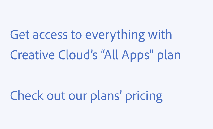
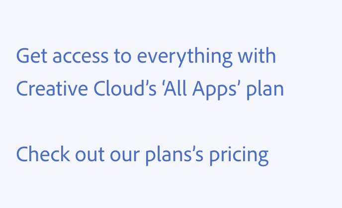
Don’t use apostrophes (') in place of quotation marks.
When pluralizing singular and plural words, add apostrophe-"s" when there’s no "s" at the end. For plural nouns that end with "s," add only an apostrophe.
For any other specifics on possessive apostrophes, refer to the AP style handbook.
Asterisk
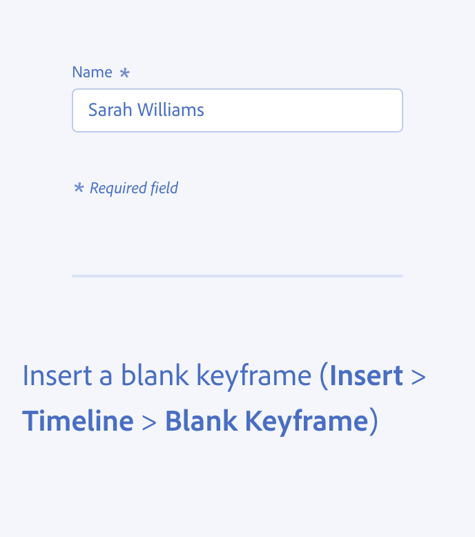
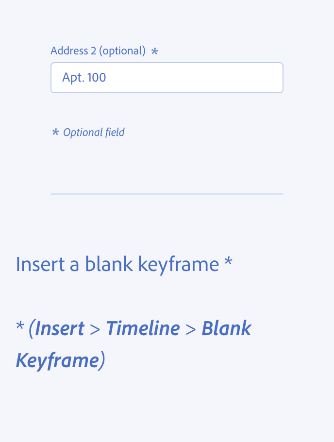
Use asterisks ( * ) or "(required)" to establish form fields as required. Don’t use asterisks to denote anything as optional.
Make sure to use the Spectrum asterisk icon that comes built in with the design components — not the text form of an asterisk within the label string.
Don’t use asterisks in running text or labels when parentheses or a tooltip would suffice.
At sign
Don’t use the at sign (@) in place of the word "at."
Brackets
Don’t use brackets ([] {}) in UI copy or running sentences. Instead, use parentheses ( ( ) ).
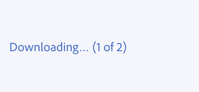
![Key example of using parentheses instead of brackets. Incorrect usage. Downloading… [1 of 2], with brackets instead of parentheses surrounding the “1 of 2” count.](./media_1b3974803e5b3747213962fbd3f1504f786f0cf7c.png?width=750&format=png&optimize=medium)
Colon
Try to simplify a complex sentence into multiple sentences first, but if you can’t, try a colon (:).
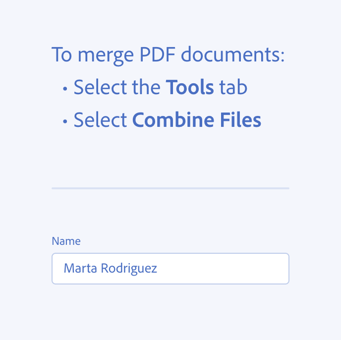
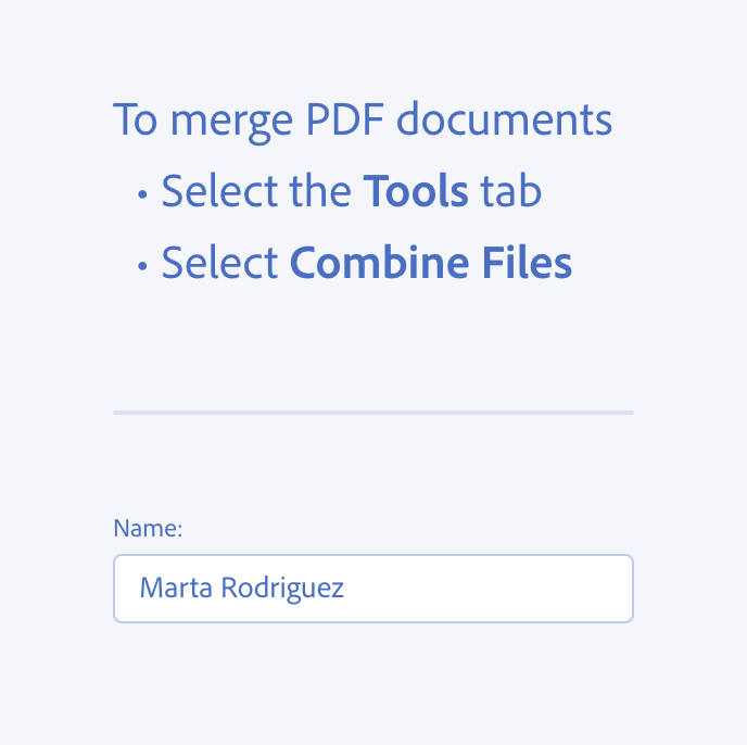
Colons are helpful when introducing lists of items or steps in a workflow. The lists and steps should be introduced on new lines. They’re also useful for high-level headlines or marketing-sounding UI content.
Don’t use a colon at the end of a label for a form field. The design component should already communicate the relationship between the label and the input.
Comma
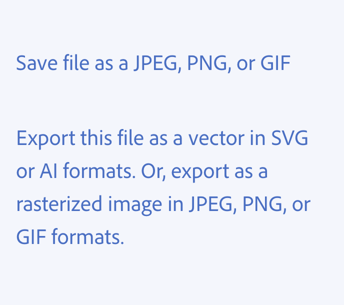
When listing things, use the serial comma (also known as the Oxford comma). This means providing a comma before the word “and” when listing multiple items in a sentence.
If you’re having to use a lot of commas in a sentence, consider whether you can split the sentence up with periods or em dashes.
Ellipsis
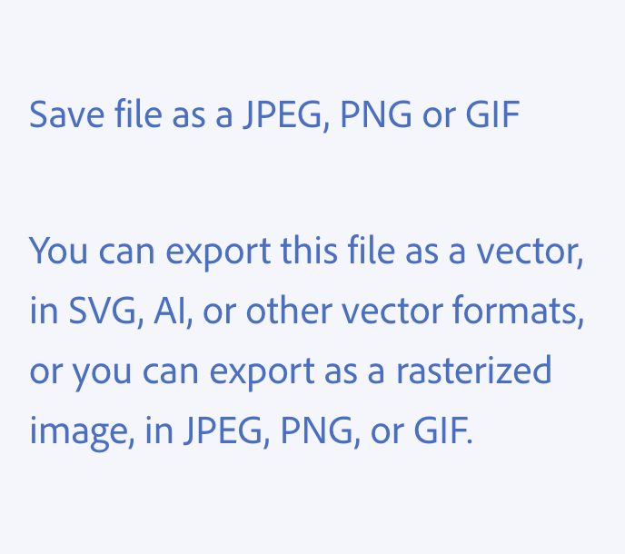
Use ellipses (…) when truncating text in small spaces.
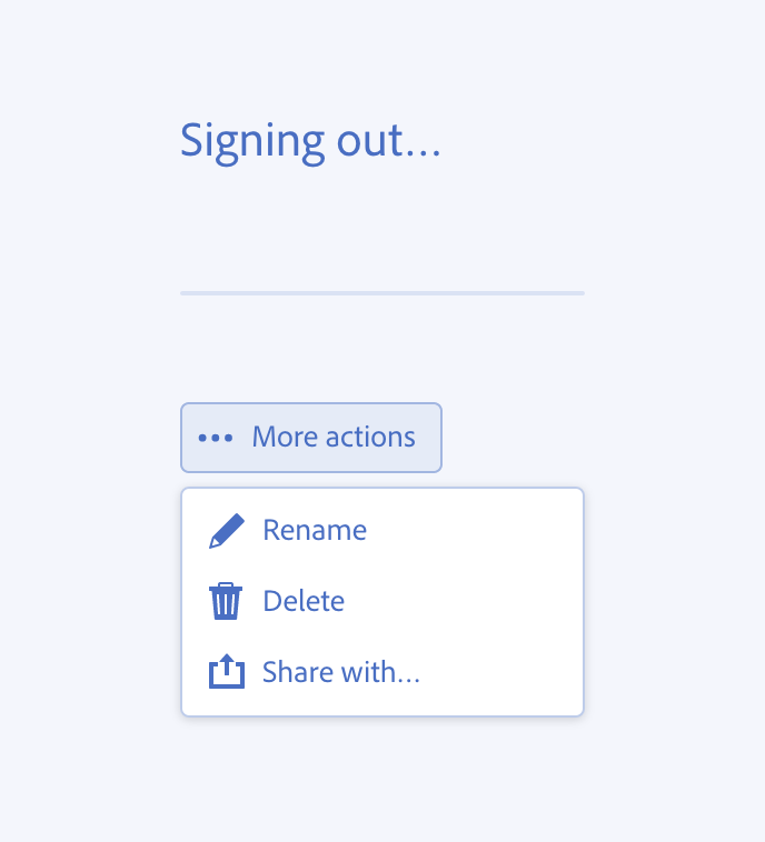
Use an ellipsis at the end of the text to communicate the progress of something that is in process, such as a waiting or loading state.
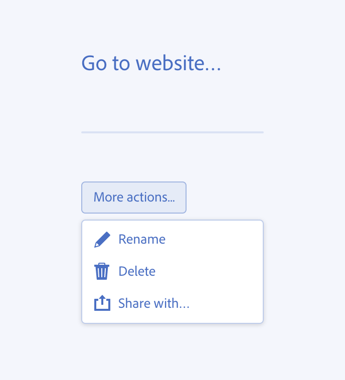
In general, avoid using an ellipsis in a button. If a button will take a user to a completely different or more complicated view (such as going from a dialog to a settings panel), it can be acceptable to include an ellipsis at the end of the label text to communicate that there's more action needed beyond the button's initial interaction.
For prompt text in a picker, use an ellipsis at the end of the text to communicate that a user can select an option (e.g., “Select category…”).
If your product uses a menu pattern native to an operating system (OS), follow the company’s guidelines. If it uses Spectrum’s Menu component, see Ellipses in menu commands.
If you need to directly refer to a UI element whose name ends with an ellipsis (e.g., “Find…“) in running text, drop the ellipsis: “Use Find to search the database.”
Use the more icon (not an ellipsis as a string of text) when designing a More menu.
Emoji
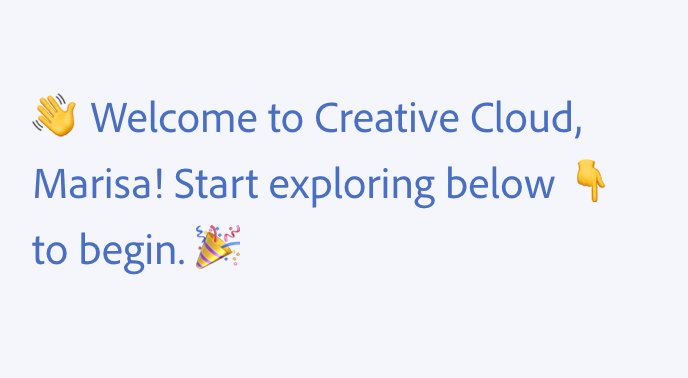
Don’t use emoji in any interface language.
Emoji often convey tones that may be inappropriate in certain contexts. They’re also difficult to localize, and tend to diminish readability and comprehension.
When writing about emoji, you can have one emoji or multiple emoji. The spelling is the same for both the singular and plural noun forms.
Equals sign
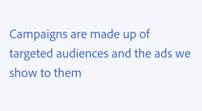
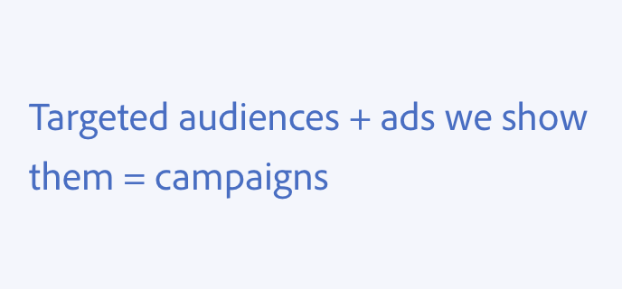
Don’t use an equals sign (=) in place of the word "equals," and don’t use this as shorthand for "meaning," "means,” or "is."
Exclamation mark
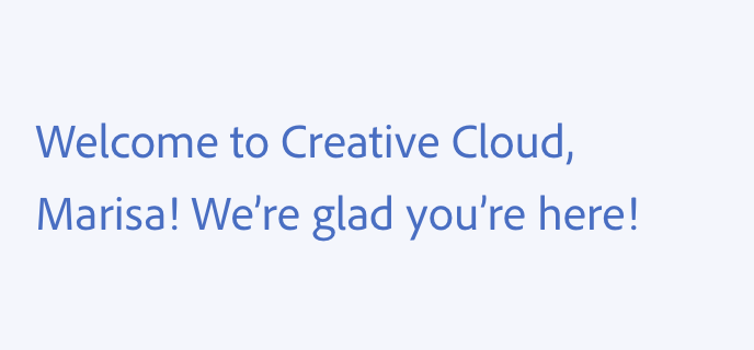
Don’t use exclamation marks (!) since they are difficult to localize and easy to overuse.
Greater than and less than
When communicating navigation, such as in breadcrumbs, use the "chevron" icon built into the component, not the greater than symbol.
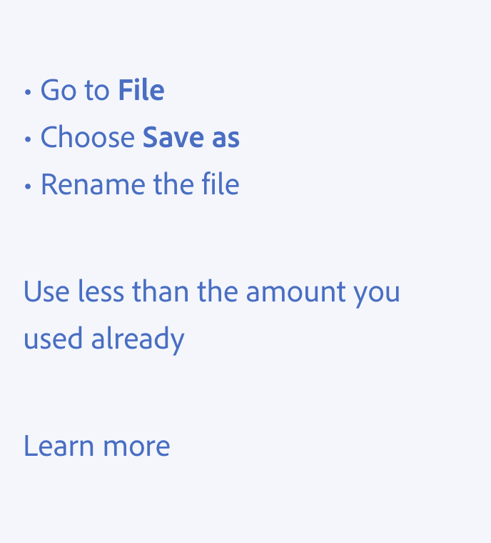
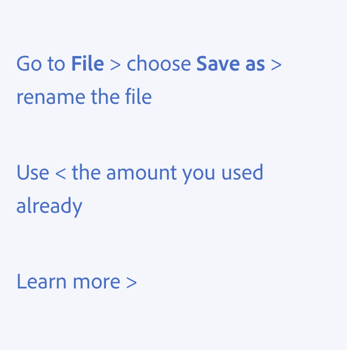
Don’t use the greater than and less than symbols to communicate steps in a flow — use bulleted or numbered lists instead.
Don’t use these symbols to replace the words "greater than" or "less than." And don’t use them to accent or decorate a word.
Hyphen and dash
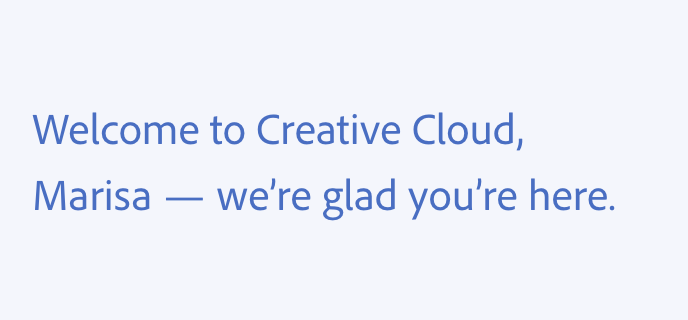
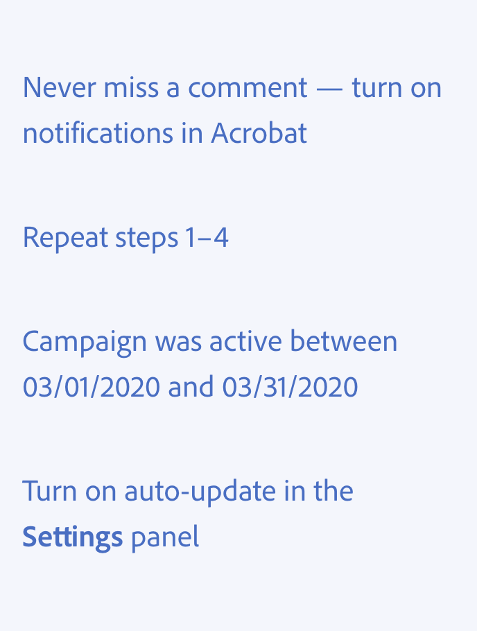
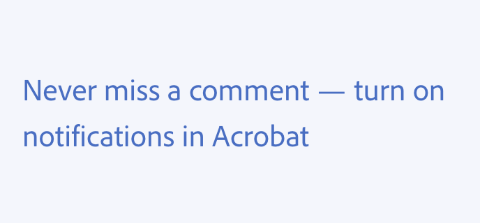
Use em dashes (—) to separate distinct but related thoughts. Include spaces before and after the em dash.
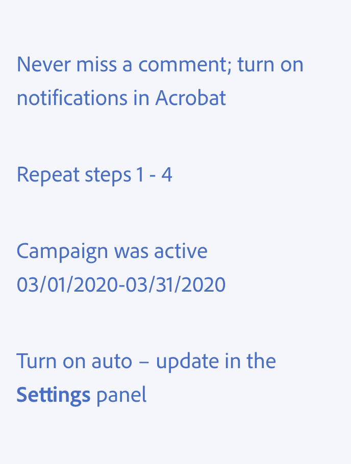
Use en dashes (–) for number ranges and lengths of time, with no spaces before or after the en dash. Don’t use them when paired with the words “from” or “between.”
When needing to show gaps in data in a table, use an en dash to represent null, unavailable, or inapplicable values.
Use hyphens (-) between words, and with no spaces before or after the hyphen.
Minus sign
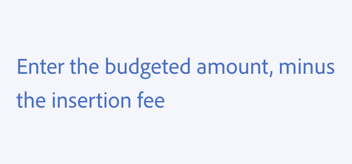
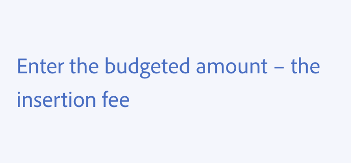
Don’t use the minus sign (-) in place of the word “minus,” “without,” “less,” “negative,” or other words related to subtraction.
Parentheses
Use parentheses ( ( ) ) to provide supplementary context.
Don’t use parentheses in simple tooltips. In rich tooltips, they can indicate keyboard shortcuts. Don’t use brackets in place of parentheses.
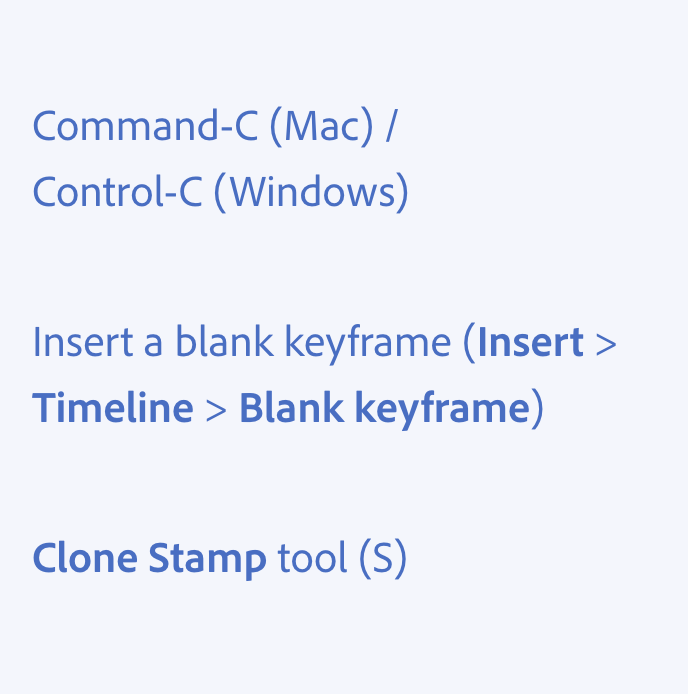
![Key example of using parentheses. Two examples of incorrect usage, with parentheses not needed or brackets used instead of parentheses. Cloud documents are saved online to Adobe's cloud (collaboration and other features are on the way). Clone Stamp tool [keyboard shortcut, S].](./media_1e8e996e2cc9e225730b4279a5ad9dc15ea8c53e5.png?width=750&format=png&optimize=medium)
Period
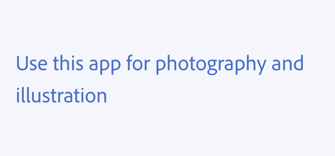
In general, if your text is a full sentence, add a period to the end. If it's a short, direct phrase — either standalone, or within a UI component like a toast or alert banner — don't add a period.
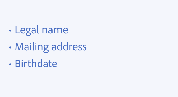
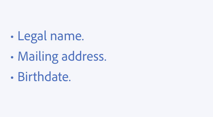
In the majority of cases, don’t use periods (.) or any other punctuation on the end of bulleted or numbered lists. If one list item is a complete sentence, then it would end with a period (or question mark). In this case, use periods at the end of all items.
Don’t use periods in headers or buttons.
Plus sign
Don’t use plus signs (+) in place of the word "and," bullet points, or as any other design elements.
Don’t use plus signs when indicating there is more of something available.

Question mark
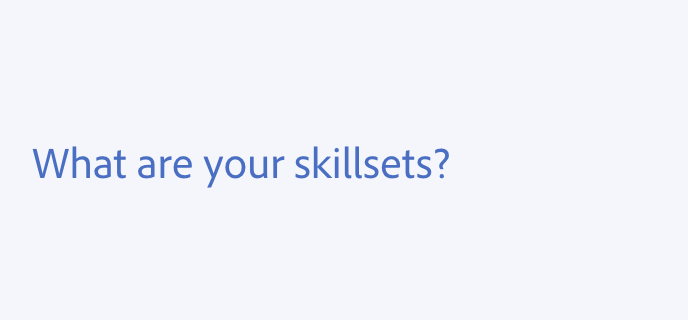
When writing titles, questions marks (?) are the only acceptable punctuation mark to include.
Avoid using question marks to ask rhetorical questions.
Quotation mark
In UI copy, only use quotation marks (“”) when quoting someone’s words or when referring to a file or asset name. Always use smart quotation marks (also called “curly” or “directional”), except when showing code.
Smart quotation marks are easier to read because they better match the other characters in a typeface. Straight quotes may also be confused with prime symbols, which are used for measurements.
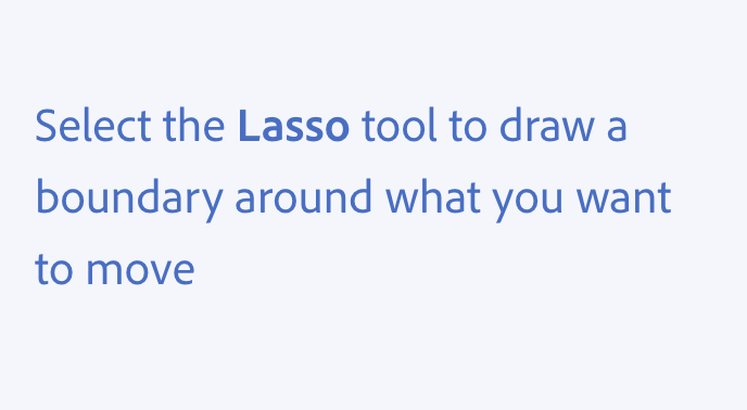
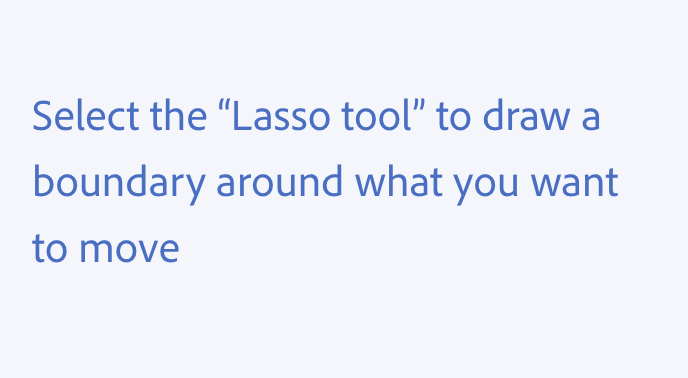
Don’t use quotation marks when directly referring to interface elements. View the Typography page for guidance on using bold text to do so.
Semicolon
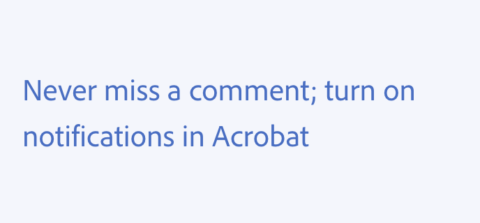
Don’t use semicolons (;). If you need a break in a sentence, use periods, commas, or occasionally em dashes.
While semicolons are useful for connecting two related thoughts, they add a formal and academic tone to text and have shown to negatively affect user comprehension in UX writing.
Slash
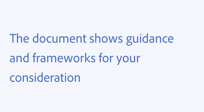
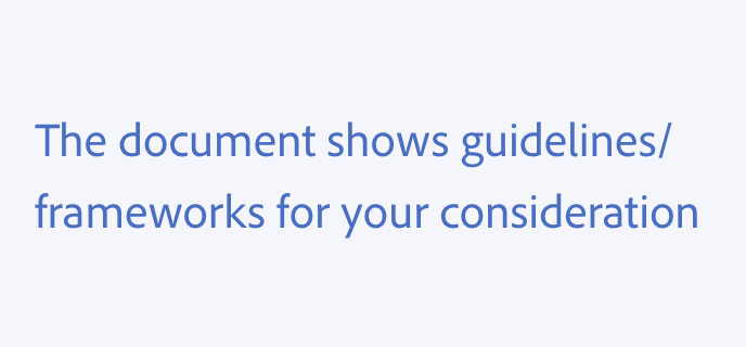
Don’t use backward slashes, and don’t use a forward slash ( / ) to combine words or ideas. This comes across as noncommittal, and affects comprehension and clarity. Instead, use the words “and” or “or.” Don’t use “and/or.”
Vertical bar
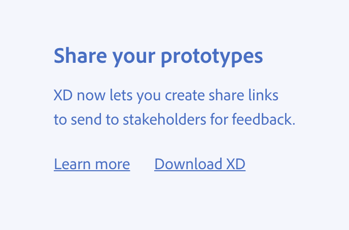
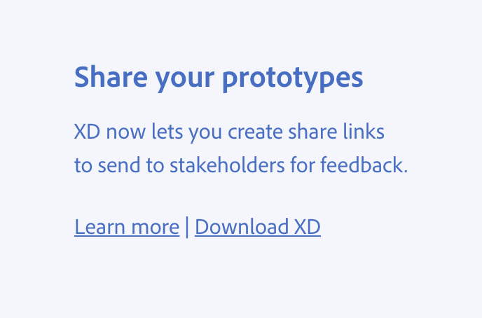
Don’t use the vertical bar (|) in running text. Avoid using it to divide information in places other than webpage titles tags and footer info. It shouldn’t be used for purely stylistic or decorative purposes when blank space between items is sufficient.
When you use the vertical bar, use an icon and not its text form. Additionally, make sure you change its name in JAWS to “Pause” for proper accessibility.
Abbreviations
Use abbreviations consistently throughout your experience to help with predictability and usability. When writing string descriptions or alt text, be sure to write the full word so that the content can be properly localized and so screenreaders will read the actual word instead of spelling out the abbreviation.
Amounts
Use K for thousands, M for millions, B for billions, capitalized, no periods. Include a space between the number and the unit of measurement (e.g., "71 M records found").
Measurements and dimensions
For full sentences where measurements or other numbers are present, use AP style and spell out the unit of measurement (e.g., 2 points, 2 picas, 2 pixels, 2 megabytes).
Similarly, use AP style when abbreviating measurements or time. Make sure there’s a space between the number and the unit of measurement (e.g., 2 pt, 2 MB, 2 min, 2 hr).
Months
Use Jan, Feb, Mar, Apr, May, Jun, Jul, Aug, Sep, Oct, Nov, Dec (no periods).
Days
Use Sun, Mon, Tue, Wed, Thu, Fri, Sat (no periods).
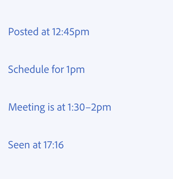
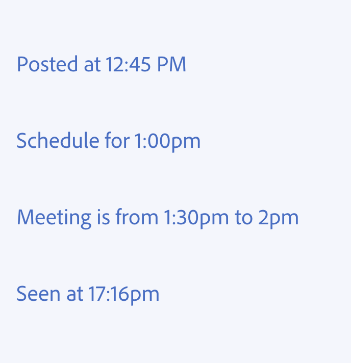
Time
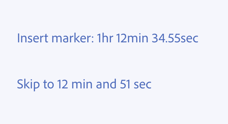
Use sec, min, hr as singular, no periods, no comma, and with a space in between the number and the unit of time (e.g., 1 hr 21 min).
Use lowercase am and pm indicators without a preceding space, unless you’re describing 24-hour time (e.g., 17:15).
Numbers
Currency
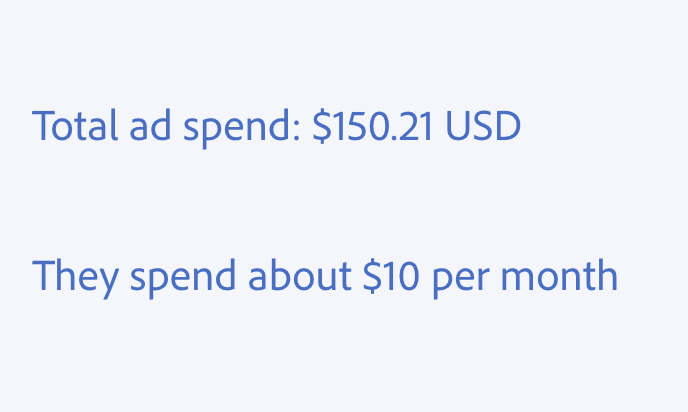
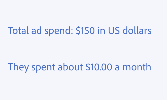
Use the numerical form of $1.00 when formality is needed, or when the number is dynamic and might include cents.
Use the number form of $1 when you need a more casual, neutral tone or if there is a space constraint and you can round off to the nearest dollar.
Use the international abbreviation for the currency when you need to disambiguate types of currency (e.g., "$100 USD equals $138.21 SGD").
Large numbers
Use a comma to offset groups of three digits, for readability:
- 10
- 100
- 1,000
- 10,000
- 100,000
- 1,000,000
But for the best readability, when citing large, round numbers, spell out the word:
- 4 thousand
- 81 million
- 2.5 billion
Numerals
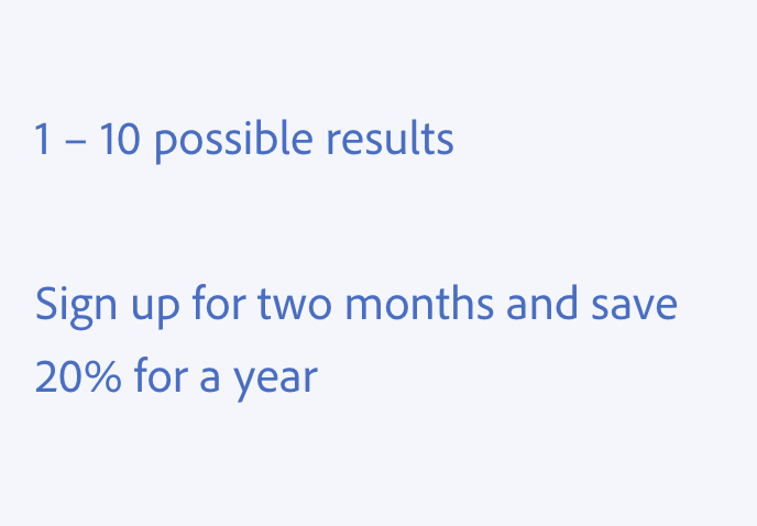
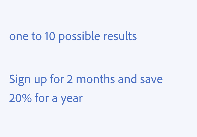
In running text, write out the words zero through nine, then start using the number for 10 and higher. When telling time, presenting a series or range, or providing a timestamp, use the number forms: 0 through 9.
You can adjust how you format numerals if you feel it’s appropriate for your situation. Using a number adds more emphasis than spelling out the word. For example, if you were to say “Compare two files and see the changes,” the emphasis is on the comparison, not on the number of files. "Read all eight comments" focuses on the availability of comments; "Read all 8 comments" focuses on the number of comments.
If you’re mentioning currency or time alongside other types of numbers, spell out the number to make the currency or time more prominent.
Percentages
Use the percent symbol (%) instead of spelling out the word "percent."
Dates and time
Dates
Date formatting is contextual, and it will depend on your product and use case. Different kinds of date formatting can be used for standalone strings in running text or for strings in more data-rich views.
Some experiences might require the full format, where others might require something more compact:
- Full: Monday, August 21, 2017 at 3:07pm
- Compact: Mon, Aug 21, 2017, 3:07pm
Additionally, dates are often localized. For example, in Europe and the U.K., the previous date example would be written:
- Full: Monday, 21 August at 15:07
- Compact: Mon, 21 Aug, 15:07
For U.S. English, you can also format dates as MM-DD-YYYY, using the numeral for the month instead of the word. Use a 2-digit format (including a 0, even with single digit months and days). The 2-digit format also helps make it easier to parse and compare multiple dates, especially in tables or lists:
- 02/24/2000
- 04/01/2015
Work with a localization expert to localize dates and times for your product’s specific cases.
Learn more about the formatting for abbreviating dates (months and days) in the Abbreviations section.
Time
- Do not use :00 with whole numbers
- When presenting a range of time, use an en dash without spaces in between, and do not include am or pm on the first time if it’s the same as the last
- When translating to 24-hour time, do not include am and pm (e.g., 17:15)
Learn more about the formatting for abbreviating time (hours, minutes, seconds, and am and pm indicators) in the Abbreviations section.
Relative time
Relative time is either used to convey the amount of time elapsed since an event (such as how long since a project was last saved or edited), or the amount of time remaining in an ongoing process (such as how much longer an asset will take to render or download).
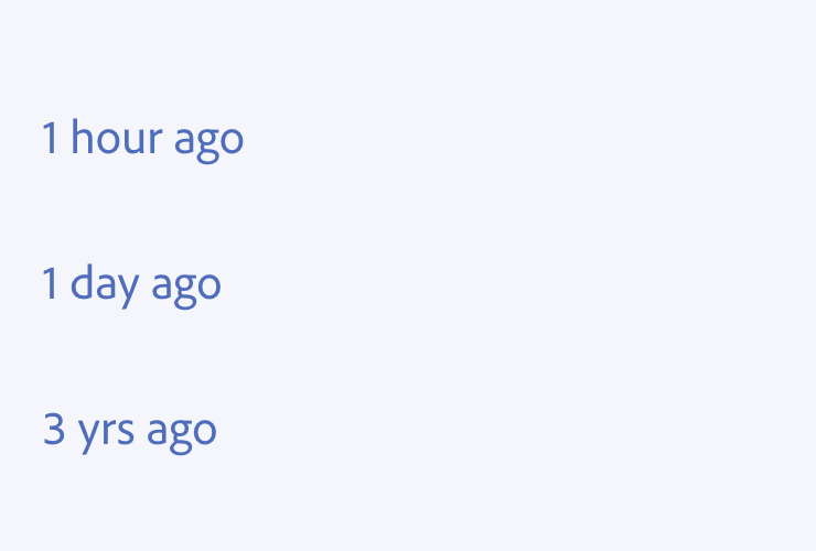
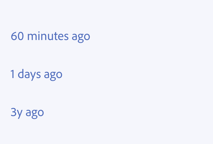
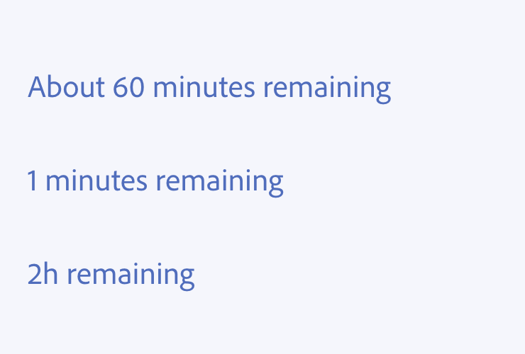
Use words like “hour,” “day,” and “month” and their respective abbreviations once the time has reached that threshold for measurement. Such as:
- 1 hour (rather than 60 minutes)
- 1 day (rather than 24 hours)
- 1 month (rather than 30 days)
- 1 year (rather than 365 days)
The usage of relative time is contextual, and will depend on your product and use case (for example, timestamps and locale style or standards). If you’re not building in U.S. English, partner with a localization expert for your product’s specific considerations.
Elapsed time
When describing elapsed time, break it down as follows:
- Just now
- 1 minute ago
- X minutes ago
- 1 hour ago
- X hours ago
- 1 day ago
- X days ago
- 1 month ago
- X months ago
- 1 year ago
- X years ago
Remaining time
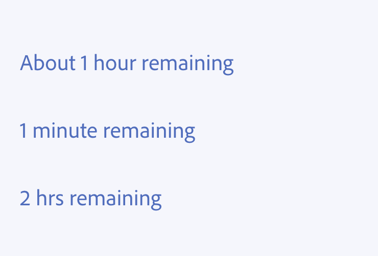
When showing remaining time, use the following pattern:
- X hours remaining
- X minutes remaining
- X seconds remaining
For describing an estimated or uncertain amount of remaining time, use the word "about" at the beginning of the string.
Timestamps
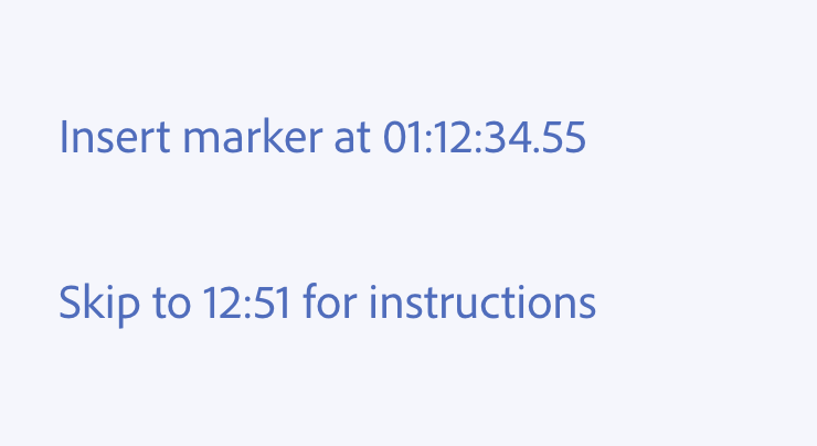
For a timestamp in a video editor where precision is needed, go by hour, then minute, then second, following this formula: HHSS.
In a tutorial playlist, for example, less detail is needed. If the video is less than an hour long, omit the hours.
Time zones
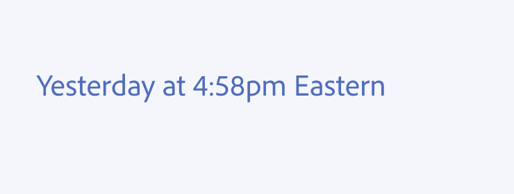
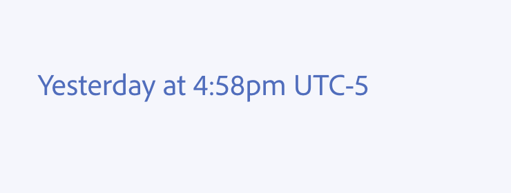
Avoid time zones unless absolutely necessary — if possible, dynamically convert to the user’s time zone.
- If the time zone is absolute, use the common name, like Pacific Time, or India Standard Time. Don’t use UTC formulas.
- If space is constrained, use a time zone's acronym (e.g., PST, EST), but make sure you provide extra context to your localization team if doing so.
- For relative time and clarity, say “in your time zone.”
Lists
Use lists to break down complex ideas and make them more readable and scannable. You can also use them to make parallel choices easy to compare.
- Use bulleted (unordered) lists to present two or more concepts of equal weight
- Use numbered (ordered) lists to present a series of sequential steps
Introductory phrases
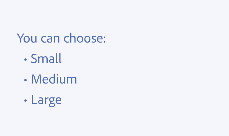
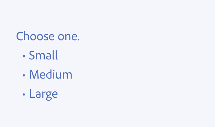
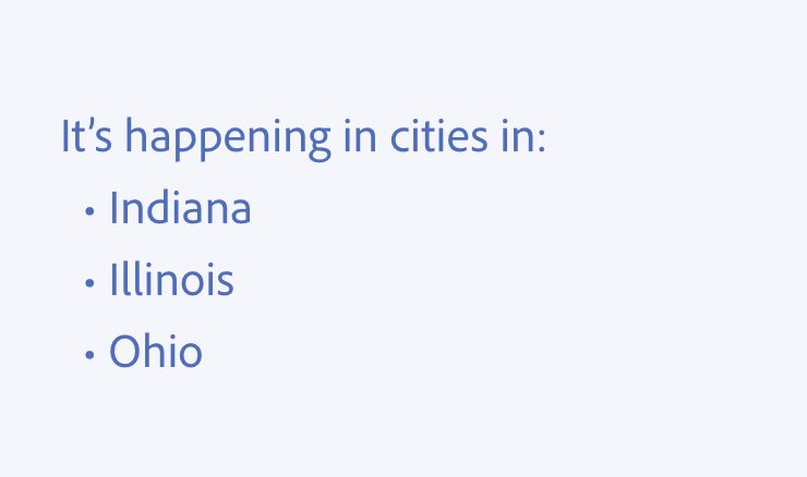
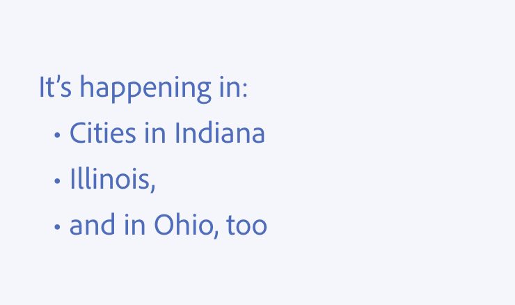
Use an introductory phrase with a colon to lead into the list, and write each list item so it works with that phrase.
Be consistent and use parallel construction
Phrase your list items to be consistent with each other as much as possible. This helps with comprehension and readability.
Some things to keep in mind when writing lists:
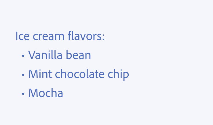
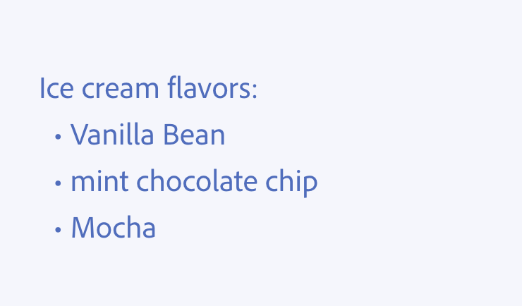
- Capitalize the first letter of each list item.
- Generally, don’t use terminal punctuation in list items, unless it’s a complete sentence or sentences.
- If the list includes action items (as in a series of instructions), the entire list should follow the same format, with the verb first. If it’s a list of nouns, all items on the list should include nouns.
Capitalize each list item
Capitalize the first letter of each list item and use sentence case.