Resources
Design resources
Figma libraries
The Spectrum 2 Figma libraries are the primary resource for Spectrum 2 components, styles, and variables. These libraries are stable, so you can use the designs in production.
We’re continuing to work on exciting improvements as we expand Spectrum 2. Make sure to regularly review design documentation to keep up-to-date with releases. Familiarize yourself with the changes to components, patterns, styles, variables, and usage guidelines. And most importantly, read the release notes (posted in #spectrum-bulletin).
For any questions, view the FAQs or contact us. To provide feedback on the Spectrum 2 Figma libraries, please visit the #spectrum-design Slack channel and fill out the embedded Slack form. Your input is important and helps us prioritize updates accordingly.
Assets, such as icons and illustrations, are published in separate libraries. Reach out to the Icons team to request product-specific icons that are not currently included in a library by submitting a request. For questions specific to the Spectrum 2 Figma icon libraries, post in #figma-icons-libraries on Slack. For general questions about icons, post in #icons.
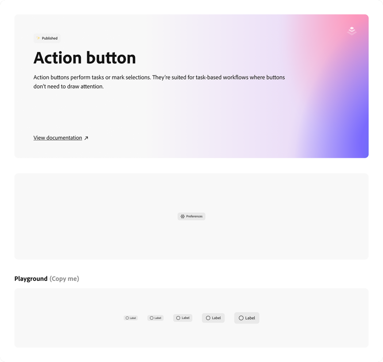
Access the Spectrum 2 web libraries:
- S2 / Web with Variables: Formerly known as S2 / Variables, this library is now a single stop for all Spectrum 2 web design data and components, including typography styles, tokens, variables, and up-to-date component statuses
- S2 / Web (Deprecated): Formerly known as S2 / Web (Desktop scale), contained Spectrum 2 components and typography styles. This library will no longer receive updates but will remain available to use until further notice.
- S2/Icons, Global: Contains a set of commonly used Spectrum 2 icons
- S2/Illustrations: Contains a set of Spectrum 2 linear and gradient illustrations
Access the Spectrum 2 iOS library:
- S2/iOS: Contains Spectrum 2 components, typography styles, and variables for iOS
If you don’t have access to Figma, you may be able to request view-only access through your product’s design team. Learn more at the Adobe Design Figma Usage: Guidelines and Resources wiki.
Implementation resources
As the design of Spectrum 2 is finalized, the existing design data will be updated and released incrementally. For more information, view our Developer overview page.
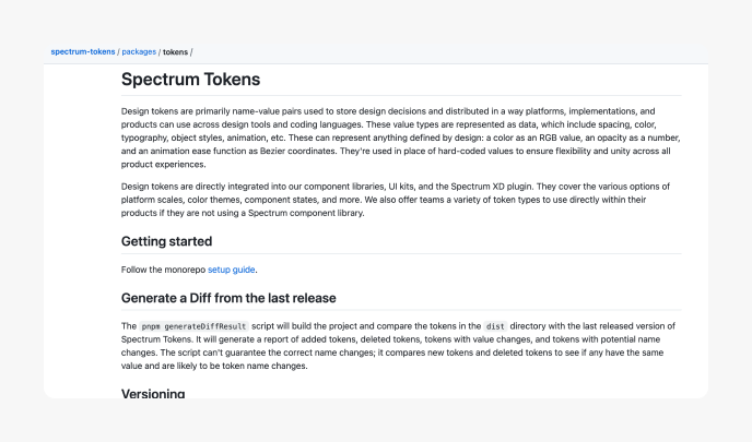
Spectrum Tokens repository
This GitHub repository houses Spectrum’s design tokens, which are primarily name-value pairs used to store design decisions and distributed in a way that platforms, implementations, and products can use across design tools and coding languages.
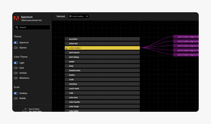
Spectrum Token Visualizer tool
This tool allows you to search for token names or values, filter values by scale and theme, and explore the relationship between Spectrum’s tokens by selecting tokens to see their connections.
Resources for product developers
For teams developing with an implementation of Spectrum, reference that implementation’s documentation for information regarding component availability, specific usage guidelines, and other developer resources. More information is also available on the Developer overview page.
Spectrum Web Components
Spectrum Web Components 1.0 uses an approach to Spectrum 2 that applies the design system’s new colors, corner radii, and icons to its components without introducing breaking changes. For more detailed information about this approach, read the initial announcement on the Spectrum wiki.
When Spectrum Web Components 2.0 releases, it will include the full Spectrum 2 implementation of its components. The team is currently defining the product strategy, and major announcements about its availability and timeline will be released through Slack channels (#swc-announcements and #spectrum-web-components), the Spectrum 2 Wiki, and e-mails to members of the DL GRP-SWC-OFFICEHOURS. Access to this DL is self-serve through Adobe’s IMS portal.
React Spectrum
React Spectrum’s implementation of Spectrum 2 is available for use through the npm package @react-spectrum/s2, and automated migration assistance from React Spectrum V3 to Spectrum 2 is available through the migration wizard.
Check the Spectrum 2 in React Spectrum page for more information, including which components are available and how to get started. Releases are announced in the #react-spectrum and #rsp-announcements Slack channels, and developers using the Spectrum 2 library can also request access to a dedicated support channel.
Spectrum iOS
Spectrum iOS recently released an initial set of components and foundations in its 1.0 release. More information, including the projected components for future releases, are documented on the iOS project’s wiki.
Announcements about releases are made in the #spios-announcements and #spectrum-ios Slack channels.
For instructions on how to integrate Spectrum iOS into your project, please visit the following wiki page.
View spectrum-ios on GitHub
View documentation for spectrum-ios
View documentation for spectrum-tokens-ios
Sign up for access to the Catalog App on TestFlight to try Spectrum iOS on device.
More resources
Color variables migration guide
Spectrum 2 Figma libraries are officially moving from color styles to color variables. Now that Figma variables are fully supported, color styles are being phased out in favor of directly linked variables, from the S2/Variables library. This is now a public library, enabling everyone to connect directly to Spectrum’s source of truth.
To support this transition, S2/Color has been removed from the inheritance chain in the Figma libraries. Designers should update their files to replace color styles with color variables. Following the steps in the guide will help ensure your files remain stable and aligned with the Spectrum system moving forward.
These changes are for Spectrum 2 libraries. They do not apply to Spectrum 1.
Adobe Clean Spectrum VF typography guide
Spectrum 2 uses a new default font, Adobe Clean Spectrum VF. Aesthetically, this font is the same glyphs as Adobe Clean, but it has an adjusted baseline to sit vertically centered in UI. It also includes modern variable technology for width and weight axes.
To support the new font, we’ve updated our default line-height values and introduced symmetrical vertical padding token values to our design system. The Spectrum 2 typography guide includes details about what’s changing, what’s staying the same, and options for updating design files or implementations.
These changes are for Spectrum 2 libraries and implementations. They do not apply to Spectrum 1 components.
Right-to-left mirroring and bi-directional language formatting guides
Creating interfaces that support right-to-left (RTL) and bi-directional (Bidi) languages is essential to ensuring that our products are inclusive of global audiences. These guides, created by the Adobe International team, offer comprehensive frameworks on how to design and build for both web and mobile components.
View the RTL and Bidi formatting guide
View the Mirroring for RTL languages framework