Design tokens

What are design tokens?
Design tokens — or tokens — are a methodology for expressing reusable design decisions as structured data.
Tokens can represent many kinds of design decisions, including color, spacing, typography, motion, sizing, and more.
At its simplest, a token connects a design use case to a value, allowing that decision to be reused consistently across tools, teams, products, and platforms.
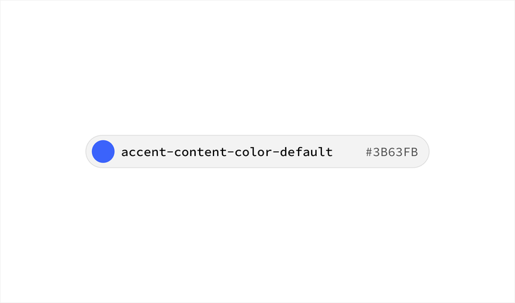
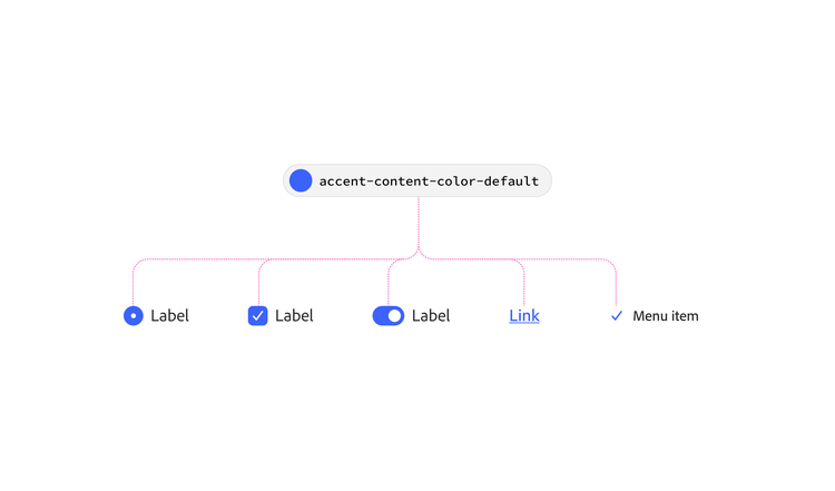
For example, accent-content-color-default expresses the decision: “Use this value when text content should be accentuated”.
Why design tokens?
Design tokens enable alignment, automation, learnability, and multi-platform fidelity, resulting in high-quality experiences and efficient system management.
By defining design decisions once and reusing them consistently, tokens create a shared foundation that helps maintain a common design language across teams, tools, products, and platforms. This allows experiences to adapt to different implementation needs while preserving the intent of the design language.
Principles of Spectrum tokens
Spectrum design tokens follow three core principles.



Clear
Design tokens are created within a well-defined scope, purpose, and meaning so they remain understandable and accurately represent the design language.
Systematic
Design tokens are defined and managed through a structured system that spans design and development resources.
Learnable
Design tokens are supported through documentation, guidance, and educational resources that help people identify, understand, and use them effectively.
Spectrum's design token system
Spectrum uses tokens as a shared foundation for expressing and reusing design decisions throughout the design system. Rather than representing every possible design scenario, the token system focuses on reusable decisions that support many structures, components, products, and experiences
Spectrum also prioritizes semantic design decisions over direct values whenever possible. By expressing intent rather than implementation details, tokens become easier to understand, easier to reuse, and more resilient to change over time.
Design tokens work together with component libraries, implementation frameworks, documentation, and other Spectrum resources to help maintain a cohesive design language across products and platforms. While tokens capture many design decisions, they are only one part of the broader system used to design, document, and implement Spectrum experiences.

Token terminology
Understanding a few foundational concepts makes design tokens easier to read, discuss, and use.
Token
A reusable design decision represented as structured data.
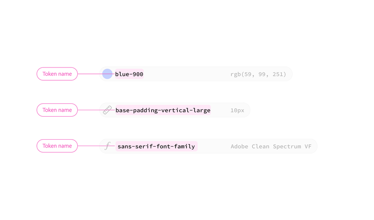
A token consists of a name and a value. Together, these define both the purpose of a design decision and the data used to implement it.
Token name
The structured classification of a design use case.
Token names are created using Spectrum's token taxonomy, which defines the categories, terminology, and ordering used to describe design decisions. This helps ensure that names remain predictable, scalable, and understandable across teams, tools, products, and platforms.
Token names form a shared language that helps people and systems understand and apply design decisions consistently across tools, products, and platforms.
Value
The data associated with a token.
A value may be a final implementation value such as a color, dimension, percentage, or duration. A value can be dependent on context, such as light or dark color themes. It may also be a reference to another token through aliasing.
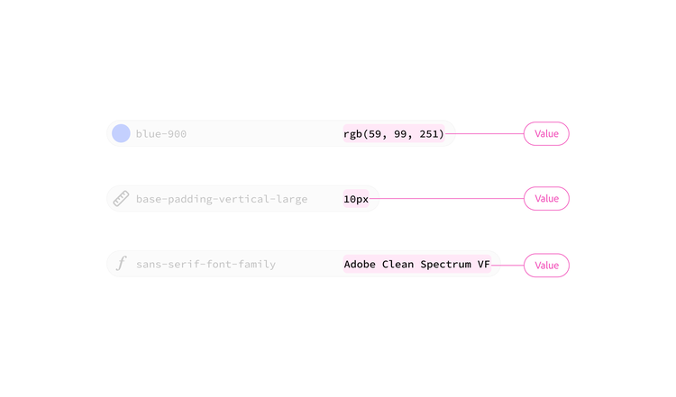
blue-900rgb(59, 99, 251)spacing-1008pxcontainer-padding-mediumspacing-300Alias
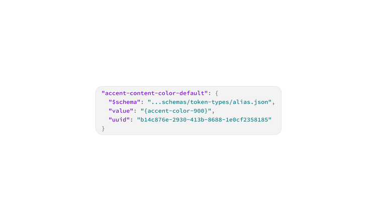
A token that references another token instead of a final value.
Aliasing allows broad design decisions to be refined into more specific contexts and use cases while preserving consistency and reducing duplication.
Each layer adds additional context without redefining the underlying value.
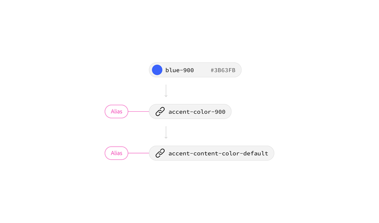
accent-content-color-defaultaccent-color-900Token tiers
Spectrum uses multiple token tiers to represent design decisions at different levels of abstraction. Each tier serves a different purpose, and together they create a flexible system that supports both reuse and adaptation.
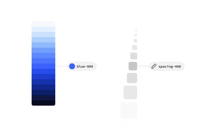
Primitive (aka Global) tokens
Primitive tokens define the available values in the design language.
They represent raw design values and generally communicate little or no information about how those values should be used.
Examples:
blue-800gray-100corner-radius-75
Primitive tokens provide the foundation for higher-level design decisions. Because they communicate values with no intent, they are typically used indirectly through semantic tokens as an alias.
Semantic tokens
Semantic tokens define how design decisions are used throughout the system. Rather than describing values directly, they communicate purpose, intent, structure, or application.
Examples:
accent-background-color-defaultnegative-content-color-defaultcontainer-padding-mediumgroup-gap-small
Semantic tokens help people understand:
- Why a decision exists
- Where it should be used
- How it relates to other design decisions
Semantic tokens are the primary way consumers interact with Spectrum design tokens.
Component-specific tokens
Component-specific tokens represent design decisions that apply to a specific component or implementation.
Examples:
tooltip-maximum-widthdivider-thickness-small
Spectrum prioritizes reusable semantic decisions whenever possible, which reduces the need for component-specific tokens. However, some implementation-specific needs may still require decisions that are scoped to a particular component.
For this reason, component-specific tokens may exist within Spectrum or individual platform implementations, but they play a much smaller role than reusable semantic tokens.
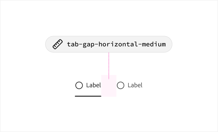
Building interfaces with tokens
Design decisions are most valuable when they can be reused.
Rather than organizing decisions around individual components, Spectrum organizes many design decisions around semantic meaning and reusable structures. Together, these concepts help create a shared language that is easier to understand, reuse, and scale across products and platforms.
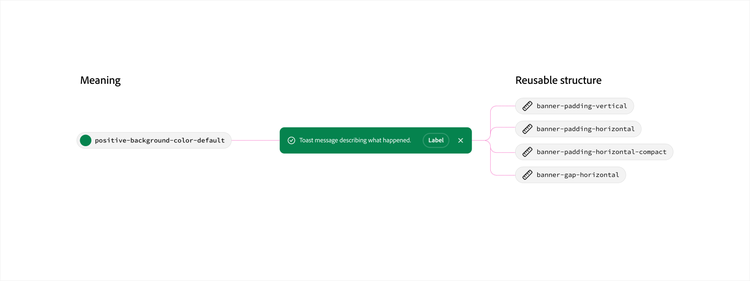
Meaning
Every design decision serves a purpose. Some decisions communicate meaning, helping users understand status, emphasis, importance, or feedback.
Examples include:
accent-background-color-defaultnegative-border-color-defaultnegative-content-color-defaultpositive-background-color-default
These decisions describe what a design choice is intended to communicate.
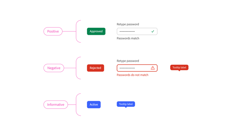
Reusable structures
While some design decisions communicate meaning, others help define how components are organized and constructed.
Examples include:
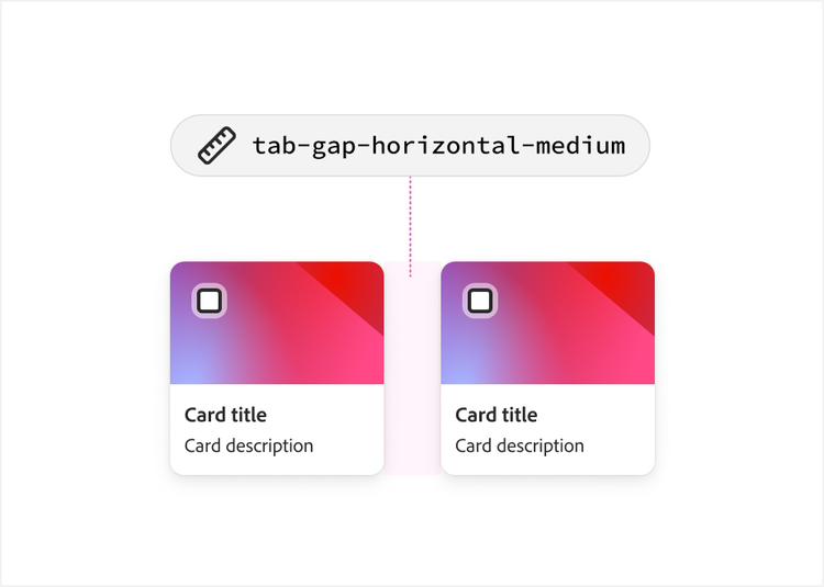
container-padding-mediumgroup-gap-smallbase-padding-vertical-largebanner-gap-horizontal
These decisions describe how interfaces are built.
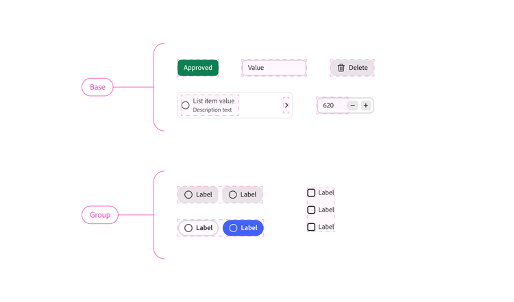
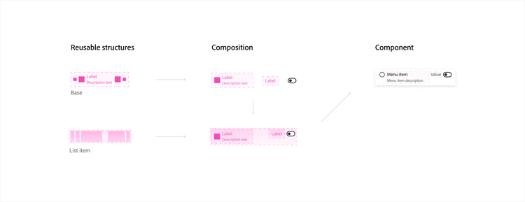
To improve reuse and consistency, Spectrum organizes many of these decisions around recurring interface structures. These reusable structures are abstract concepts that describe common UI patterns. They are not specific components or implementation types. Instead, they provide a shared framework for organizing design decisions that can be reused across many different components, products, and technologies.
Because these structures represent patterns rather than implementations, they help create design decisions that are more reusable, predictable, and easier to understand. Some structures may closely resemble familiar interface concepts, but they remain independent of any specific platform or implementation.
These structures help answer “Where does this design decision apply?”
Common structures include:
Components as compositions
Components are often composed from one or more reusable structures. Rather than creating unique design decisions for every component, Spectrum reuses decisions across common patterns that appear throughout the system.
This approach allows many components to share the same underlying design language while adapting to different contexts and use cases. Platform implementations combine these reusable structures with platform-specific requirements, interaction patterns, accessibility considerations, and implementation constraints to create complete component experiences. By reusing tokens, structures, and components, teams can build cohesive experiences without redefining the same decisions in every implementation. As a result, decisions become more reusable, components become more modular, and the system becomes easier to learn, maintain, and evolve.
Reading token names
Token names are designed to communicate the purpose of a design decision. Reading a token name from left to right reveals progressively more specific context about how that decision should be used. Names communicate information from broad concepts toward more specific details.
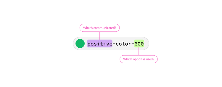
Positive color 600
The name identifies:
- what’s being communicated (positive)
- which option is used (600)
Together they represent a specific color decision.
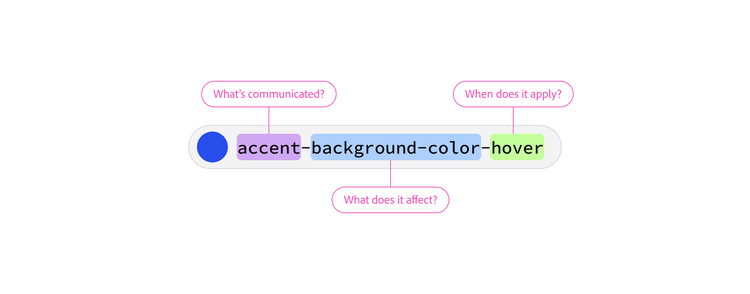
Accent background color hover
The name identifies:
- what’s being communicated (accent)
- what it affects (background-color)
- when it applies (hover)
Together they describe the background color used when an accentuated interface element is hovered.
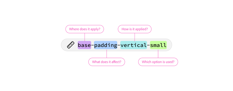
Base padding vertical small
The name identifies:
- where it’s applied (base)
- what it affects (padding)
- how it’s applied (vertical)
- which option is used (small)
Together they describe a specific spacing decision used by base structures (Action button, Text field, List item contents, etc).
Using tokens
Design tokens are intended to make design decisions easier to find, understand, and apply consistently. The following guidelines can help you choose appropriate tokens, avoid common mistakes, and build experiences that remain aligned with the broader Spectrum design language.
Start with Spectrum components
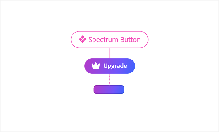
Whenever possible, use your platform's Spectrum components before working directly with design tokens. Components bring together design decisions, behavior, accessibility, and implementation guidance into reusable solutions that are already aligned with the Spectrum design language.
Design tokens provide the foundation that supports those solutions. When existing components don't meet your needs, tokens can help you extend, compose, or create experiences that remain consistent with Spectrum.
Prioritize semantic tokens
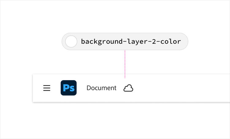
Start with semantic tokens whenever possible. They communicate intent and context, making design decisions easier to understand, reuse, and maintain over time.
Use primitive tokens only when necessary
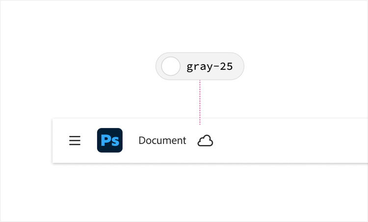
Primitive tokens define important building blocks of the design language but contain less contextual meaning. Use them only when no appropriate semantic decision exists.
Use component-specific tokens only for their intended component
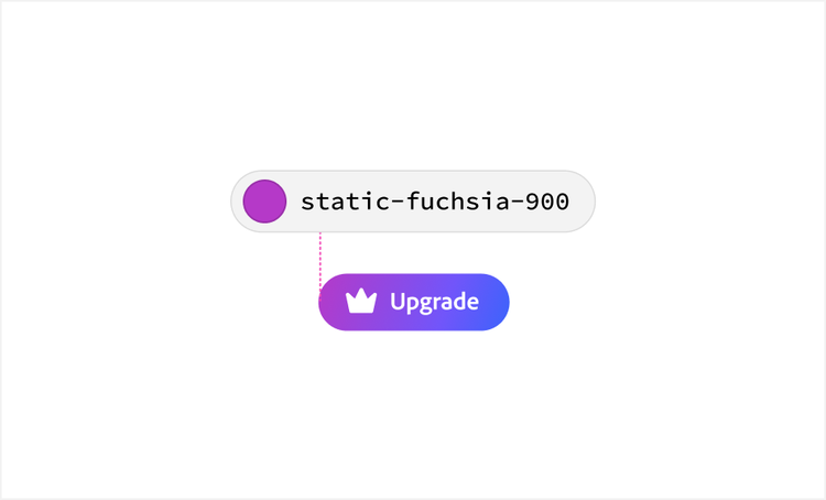
Component-specific tokens are intentionally limited. Use them only for their intended component or implementation and avoid reusing them as general-purpose design decisions.
Platform adaptability
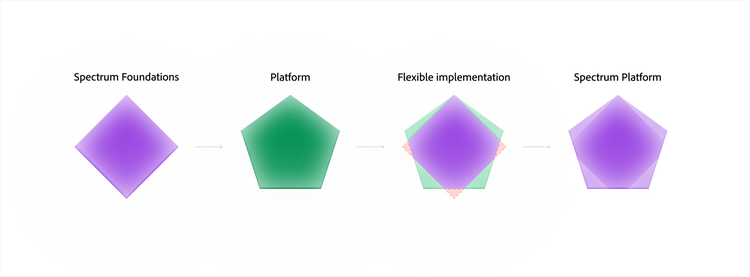
Spectrum supports many products and platforms, each with different requirements. As the token system evolves, Spectrum is establishing a shared foundation of reusable design decisions that can support platform-specific adaptation while maintaining a common design language.
Foundational tokens
Foundational tokens are shared design decisions that form the common language of Spectrum. They serve as the source of truth across products, platforms, and implementations.
Platform tokens
Platform tokens support the unique requirements of a specific platform implementation. They allow platforms to adapt shared design decisions to their own needs while remaining connected to the broader Spectrum design language.
Shared language, flexible implementation
Not every platform needs every foundational token, and token values may differ between platforms to support differences in sizing, density, theming, or platform capabilities.
Even when implementations differ, they remain rooted in the same taxonomy, terminology, and design language.